
Event Identity
- Client: Private Client (2026) | Role: Brand Designer & Art Direction
- Scope: Bilingual identity, print, digital, motion & environmental design
- Deliverables: Invitation, signage, table graphics, website, motion, editorial & guest experience

about the project
A bilingual event identity inspired by Hong Kong visual culture and traditional Chinese symbolism, reinterpreted through a contemporary design system.
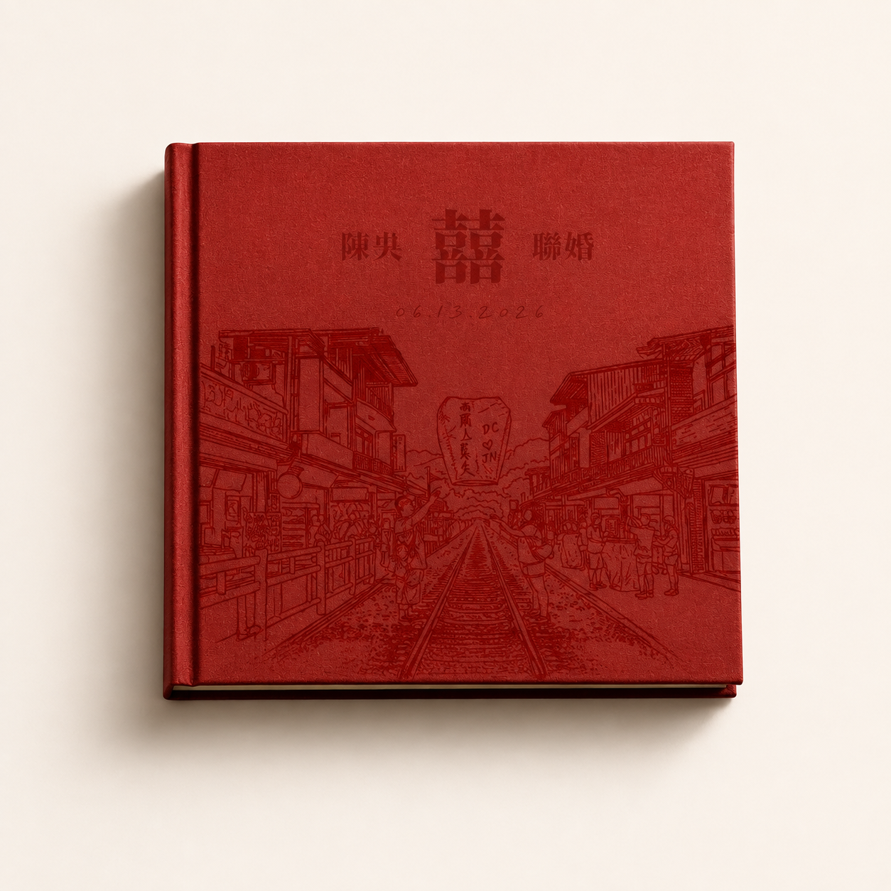
The challenge was balancing cultural character with a modern visual language without making the experience feel overly traditional or decorative. I built the direction around a bold red-and-ivory palette, bilingual typography, the double-happiness symbol, and illustrated references to Hong Kong architecture and street life.
The resulting identity was designed to flex from expressive moments to functional communication, connecting print, digital, motion, and the physical event environment through one recognizable visual language.
The challenge was balancing cultural character with a modern visual language without making the experience feel overly traditional or decorative. I built the direction around a bold red-and-ivory palette, bilingual typography, the double-happiness symbol, and illustrated references to Hong Kong architecture and street life.
The resulting identity was designed to flex from expressive moments to functional communication, connecting print, digital, motion, and the physical event environment through one recognizable visual language.
The Concept
Inspiration:
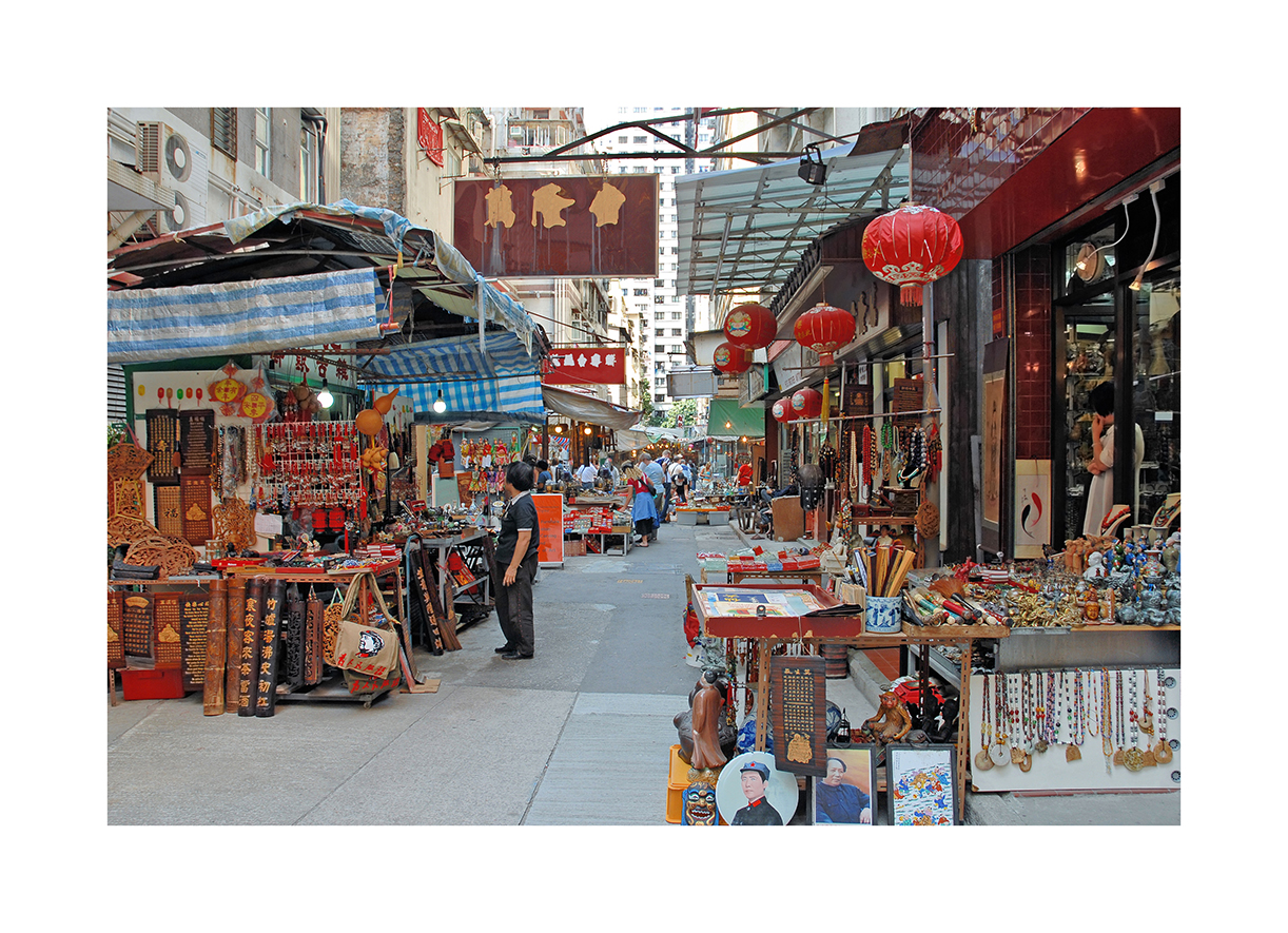
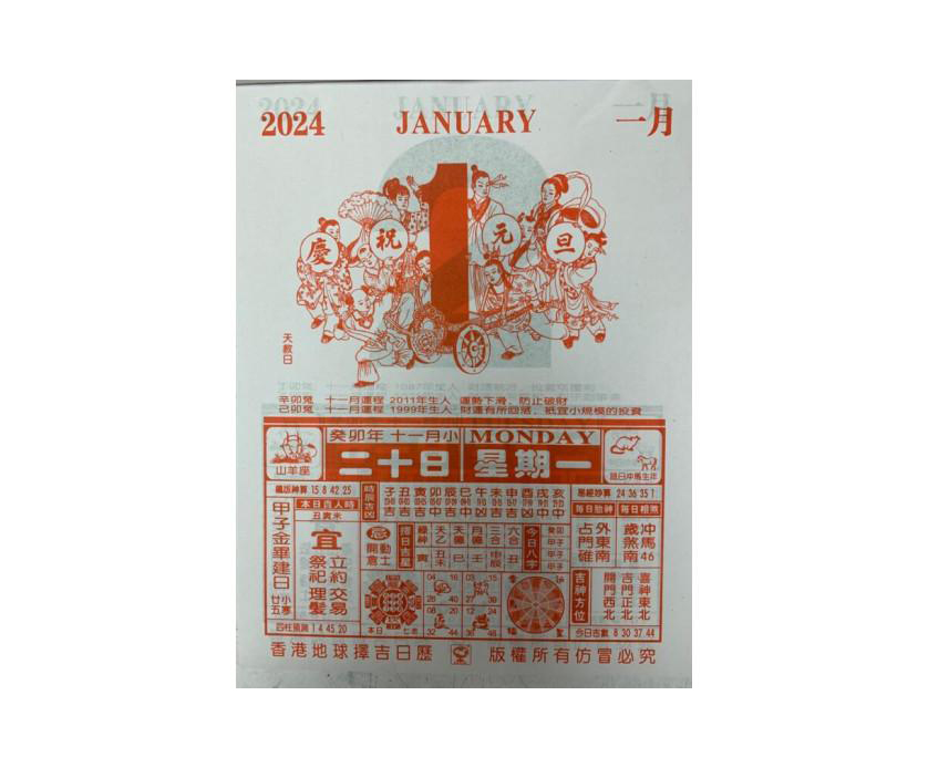
The direction began with Hong Kong tear-off calendars and the city’s dense visual environment. Oversized dates, vertical Chinese typography, compact information layouts, street signage, and architectural details became the foundation of the system.
Rather than reproducing those references literally, I extracted their visual characteristics and rebuilt them into a cleaner contemporary language that could work across different formats and scales.
The direction began with Hong Kong tear-off calendars and the city’s dense visual environment. Oversized dates, vertical Chinese typography, compact information layouts, street signage, and architectural details became the foundation of the system.
Rather than reproducing those references literally, I extracted their visual characteristics and rebuilt them into a cleaner contemporary language that could work across different formats and scales.
Identity Mark:
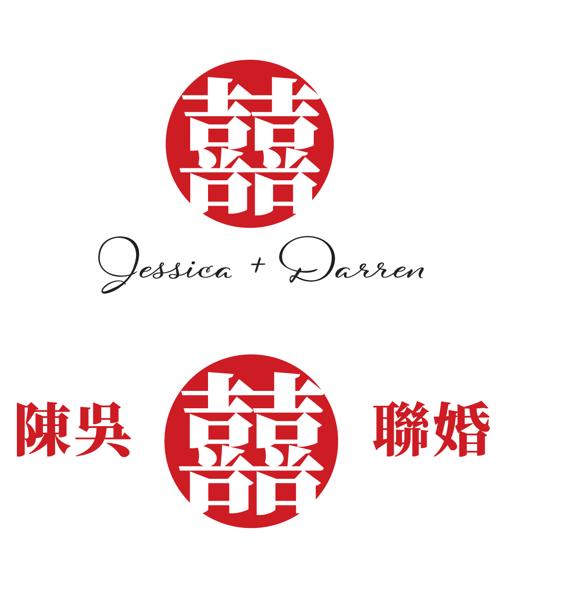
The identity mark centers on the traditional double-happiness symbol, paired with Chinese and English typography to create a flexible bilingual lockup. Simplified proportions and typography give the familiar symbol a more contemporary presence while preserving its cultural meaning.
The identity mark centers on the traditional double-happiness symbol, paired with Chinese and English typography to create a flexible bilingual lockup. Simplified proportions and typography give the familiar symbol a more contemporary presence while preserving its cultural meaning.
Invitation Design
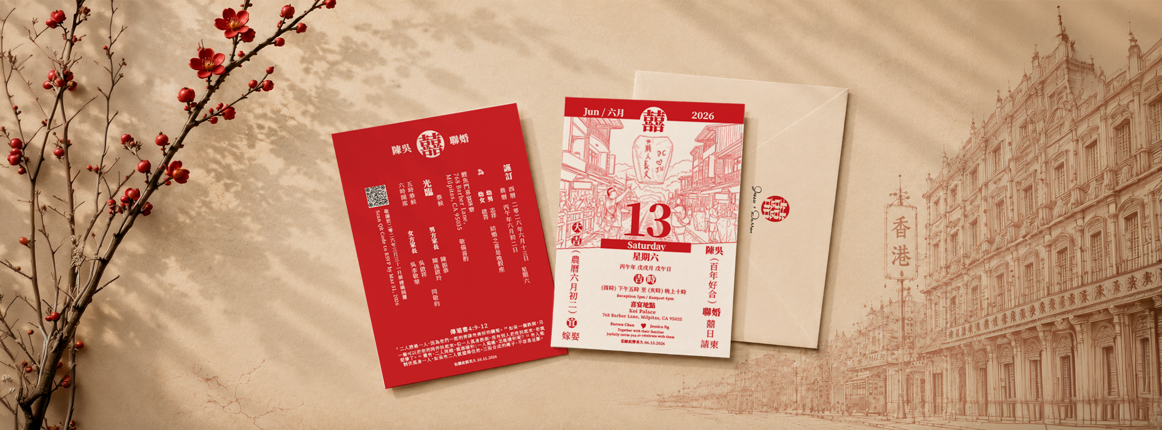
The invitation became the first full expression of the identity and established the visual language for everything that followed.
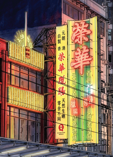
The front transforms the Hong Kong calendar reference into a bold composition built around date, illustration, and bilingual typography. The reverse shifts into a more functional information hierarchy for ceremony, reception, and guest details.
Together, the two sides balance personality and clarity while introducing elements that later extend throughout the event.
The front transforms the Hong Kong calendar reference into a bold composition built around date, illustration, and bilingual typography. The reverse shifts into a more functional information hierarchy for ceremony, reception, and guest details.
Together, the two sides balance personality and clarity while introducing elements that later extend throughout the event.
Identity In Use
- Once the core direction was established, I adapted it across touchpoints with very different functional requirements. The challenge was keeping each piece recognizable as part of the same experience without forcing every application into the same layout.
Typography, color, illustration, and bilingual hierarchy became the common framework, while composition and information density changed depending on the medium.
Table Seating Card:
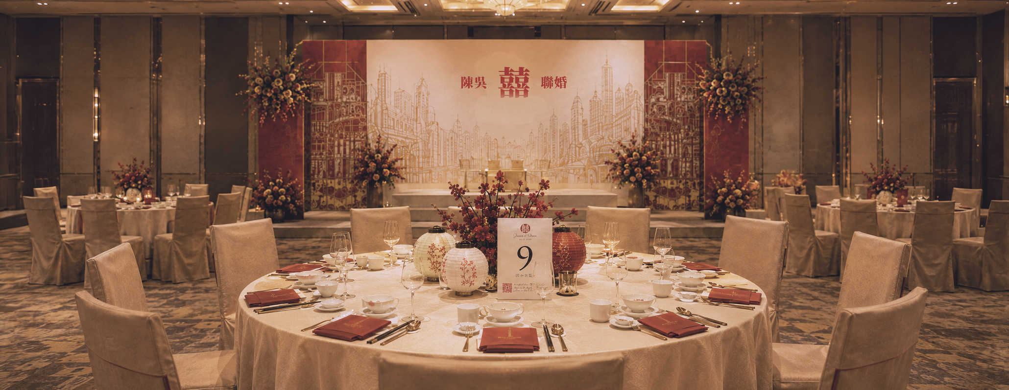
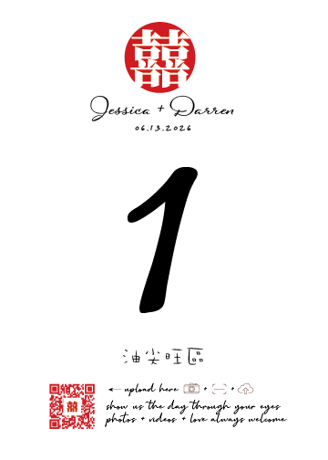
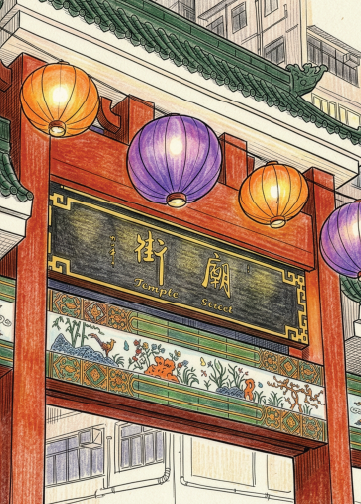
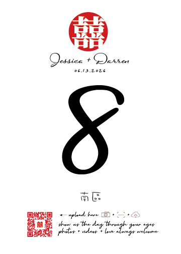
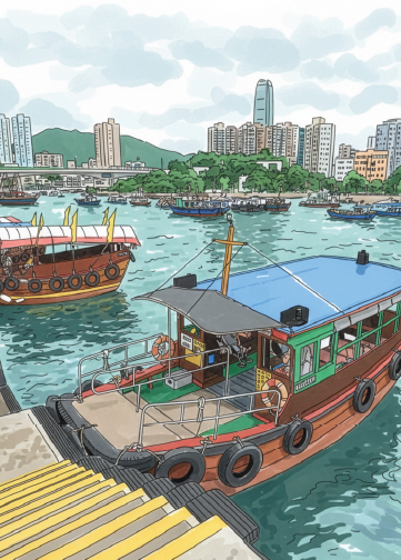
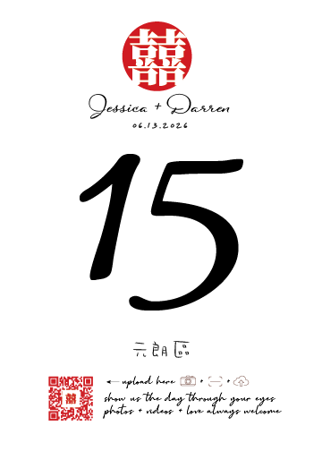
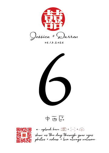
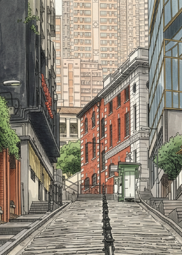
Eighteen table cards were created around Hong Kong’s 18 districts. A shared front establishes the table number and district name, while each reverse introduces district-specific architecture and visual references.
The structure stays consistent while the artwork changes, creating variety around the room without losing the larger identity.
Website:
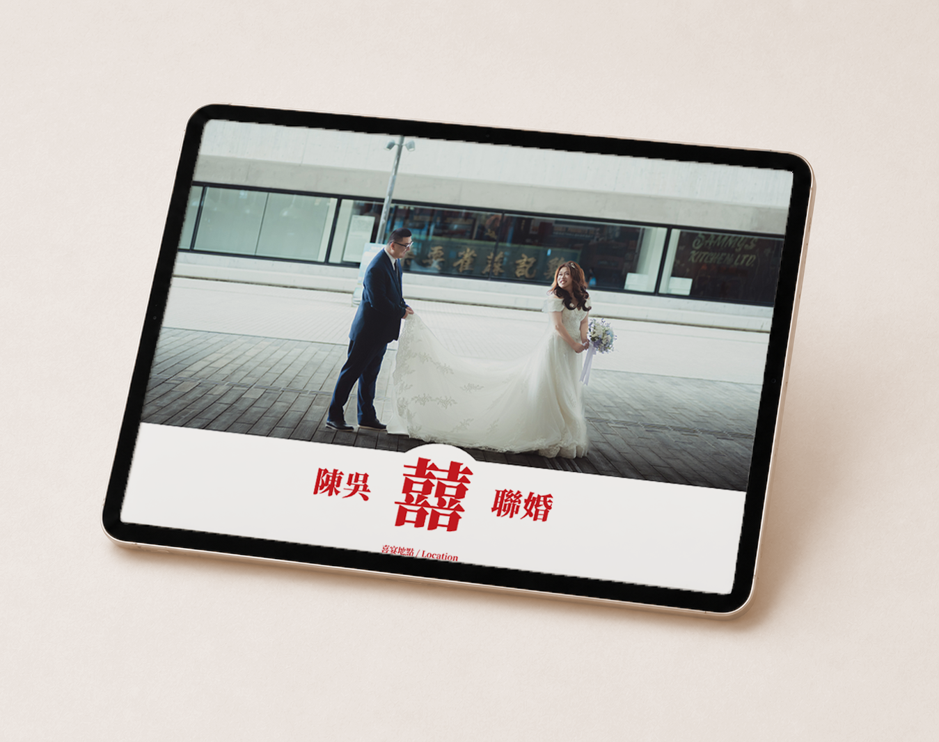
The responsive event website carries the identity into a functional digital experience covering the story, locations, schedule, gallery, and RSVP.
Rather than reproducing the print layouts, I adapted the hierarchy for screen through modular content, bilingual typography, photography, and recurring visual cues from the physical identity.
- Motion Design:
The vertical save-the-date reel extends the identity into motion through animated typography, photography, video, transitions, and music. Pacing and movement turn a simple announcement into a short visual narrative built for social media.
- Video Editing:
The event film brings photography and video together through sequencing, music, typography, and transitions. The edit focuses on pacing and visual continuity to create a cohesive story while carrying the event identity into a longer-form moving image experience.
- Photo Book:
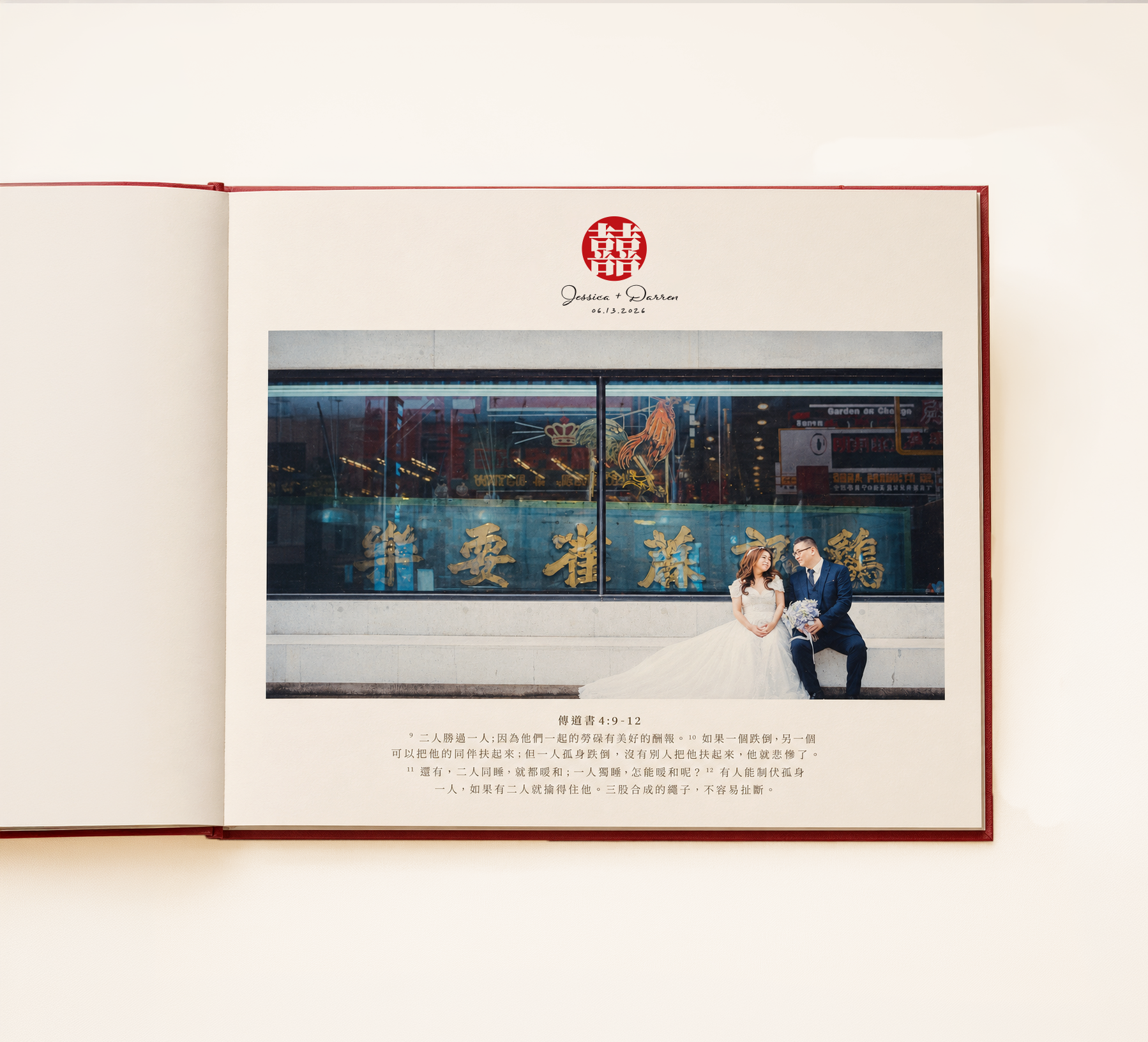
The 10×10 photo book shifts the identity into a quieter editorial expression. Full-image moments alternate with structured spreads to create rhythm, give photography room to lead, and carry the event story through a longer-form format.