

Floral Design System
- Client: BeeSure (2023) | Role: Lead Brand & Packaging Designer
- Scope: Packaging design, mechanical artwork & SKU rollout
- Production: Proofing and international vendor coordination
about the project
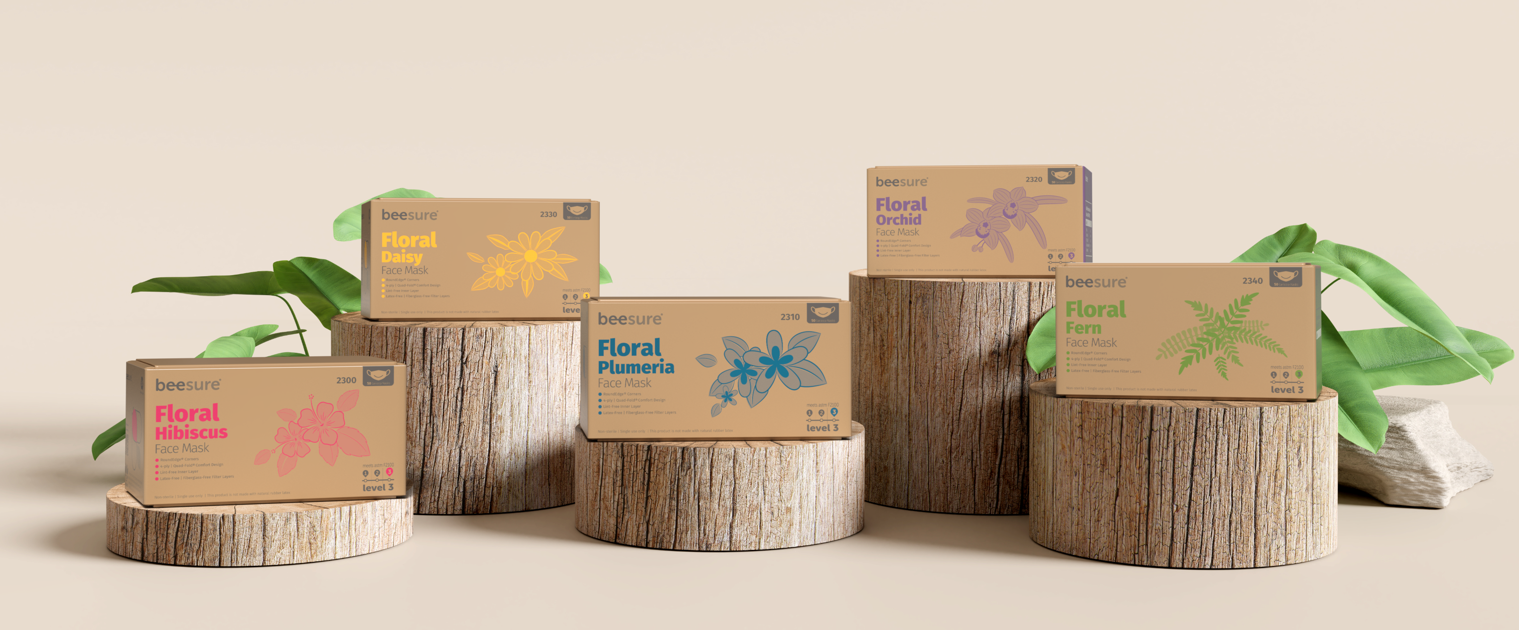
The BeeSure Floral Series translates the brand’s approachable identity into a distinct packaging family for professional face masks. I developed the system using floral illustrations, SKU-specific color, typography, and a consistent information hierarchy to differentiate each product while keeping the line visually cohesive.
My role covered packaging design and mechanical artwork through SKU rollout, proofing, and production coordination with international vendors.
My role covered packaging design and mechanical artwork through SKU rollout, proofing, and production coordination with international vendors.
CHALLENGE
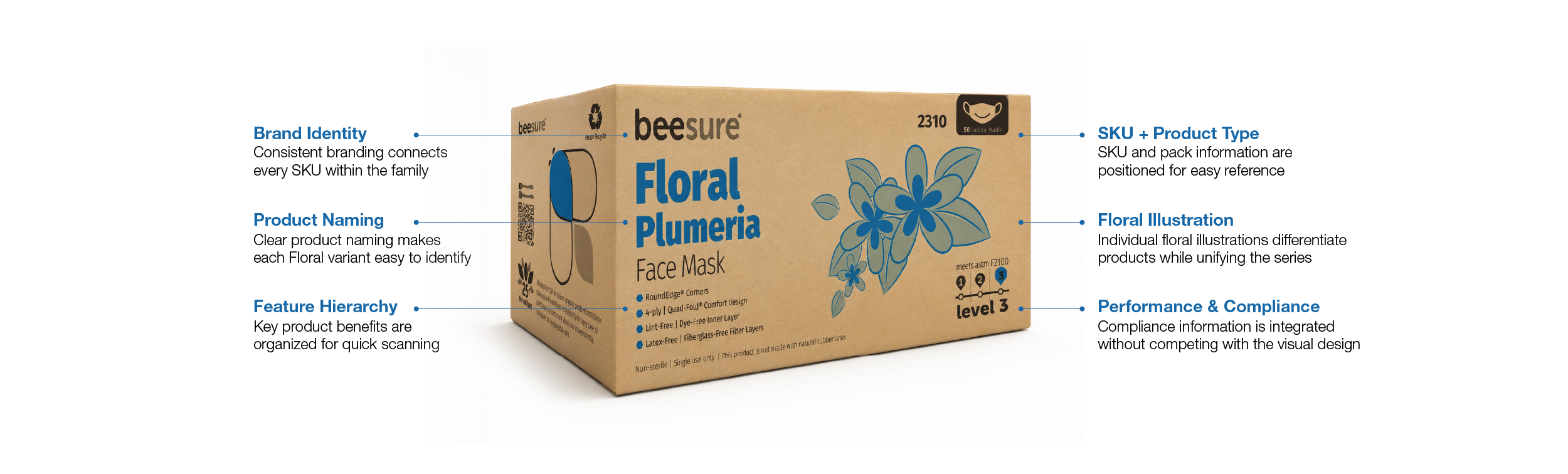
The challenge was balancing personality with function. Each SKU needed to be immediately recognizable while still feeling unmistakably part of the same Floral Series, all within packaging that carries dense product, regulatory, and manufacturing information.
The objective was to build a flexible system that could scale across products and sizes without sacrificing clarity, consistency, or the distinctive character of the series.
The objective was to build a flexible system that could scale across products and sizes without sacrificing clarity, consistency, or the distinctive character of the series.
DESIGN SYSTEM
- Floral Visual Language:
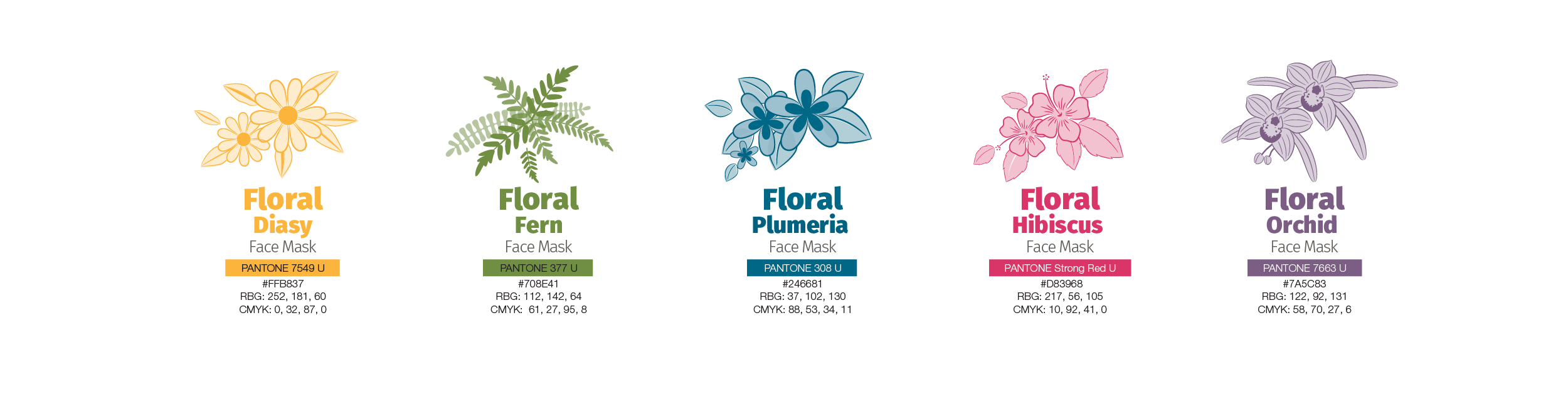
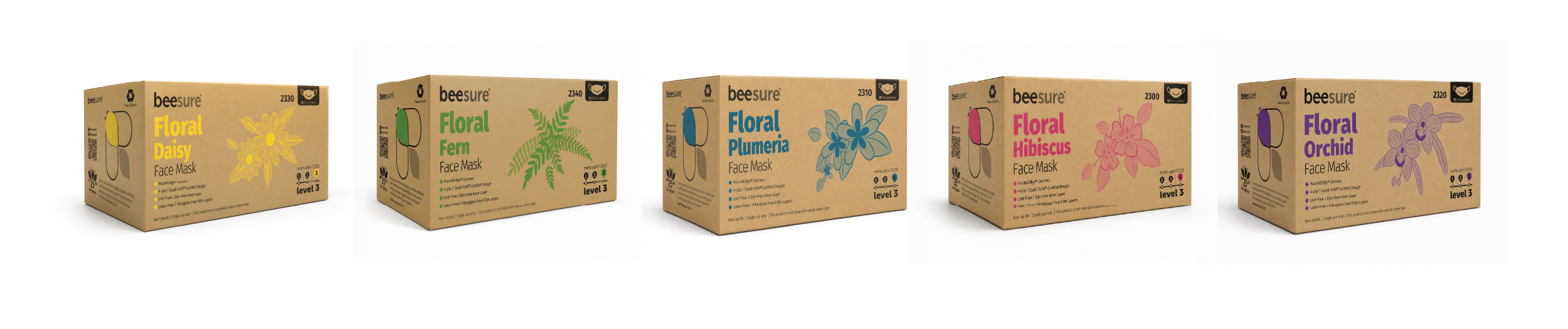
Botanical illustrations and distinct accent colors give each Floral variant its own personality while creating a warmer, more approachable expression within the BeeSure brand.
SKU Differentiation:
Each SKU uses a distinct flower illustration, product name, and accent color, making individual products easy to identify while maintaining a cohesive family appearance.
Design Constraints:
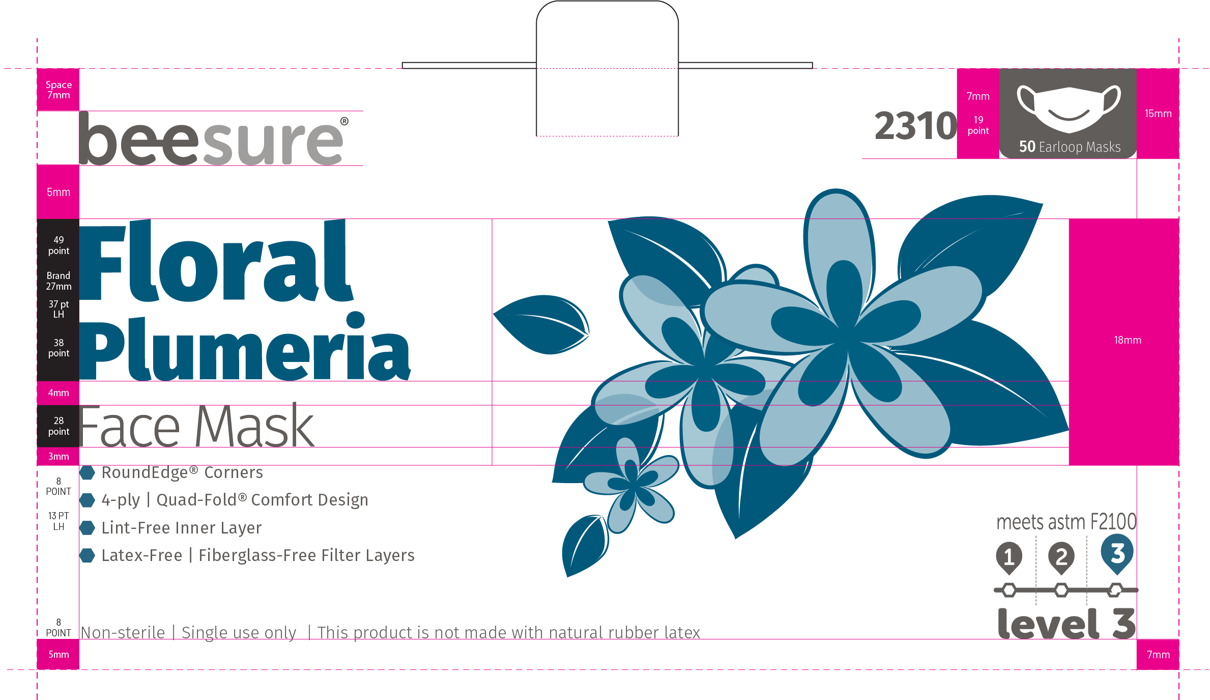
Brand and product information follows a consistent layout across packages, so the range remains familiar from one product or size to another. Fixed spacing, typography, and placement rules accommodate required FDA labeling and other regulatory content without compromising clarity or brand consistency.
DESIGN DEVELOPMENT
System Refinement:
The updated system simplifies each floral illustration into a single-color treatment to reduce print complexity and production costs. I also tightened typography, color, and information hierarchy to strengthen SKU recognition and create a system that scales more consistently across the line.
The updated system simplifies each floral illustration into a single-color treatment to reduce print complexity and production costs. I also tightened typography, color, and information hierarchy to strengthen SKU recognition and create a system that scales more consistently across the line.
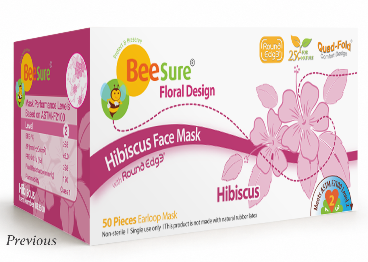
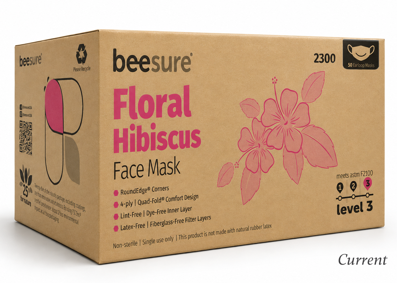
I explored variations in floral treatment, typography, color, and information hierarchy before establishing a more structured system. The floral artwork was abstracted into a single-color treatment to simplify printing and reduce production costs, while improving product differentiation, consistency, and scalability across the line.
FINAL SYSTEM
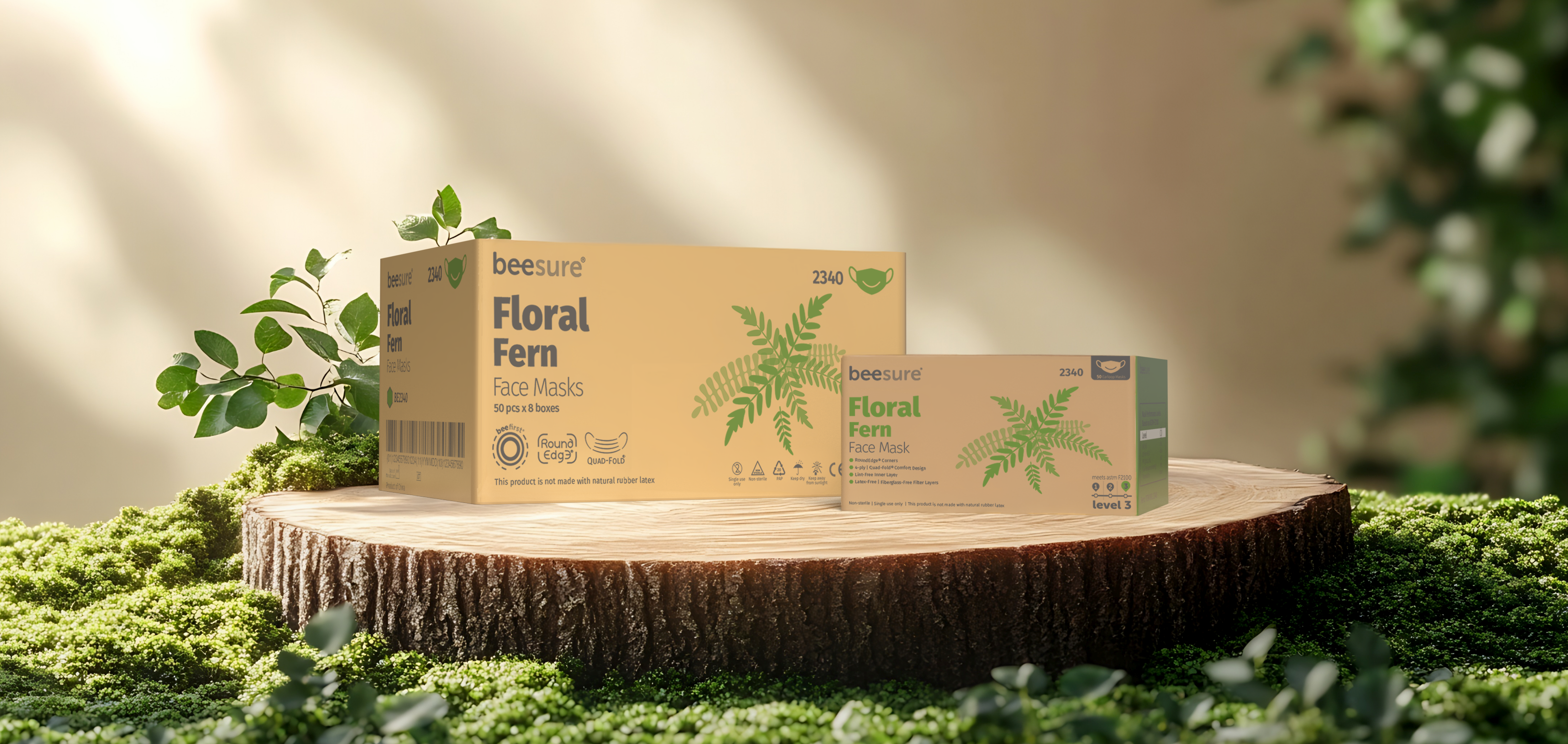
The final system extends the Floral identity across both dispenser boxes and secondary cartons, using consistent typography, color, floral identifiers, and information hierarchy across packaging levels. This keeps the line recognizable from individual SKU to case packaging while supporting efficient rollout and production.
The result is a cohesive family that is easy to navigate at the SKU level, consistent across packaging formats, and practical to maintain through ongoing production.
Part of the BeeSure brand system
Explore the complete BeeSure 2.0 Brand Transformation →
The result is a cohesive family that is easy to navigate at the SKU level, consistent across packaging formats, and practical to maintain through ongoing production.
Part of the BeeSure brand system
Explore the complete BeeSure 2.0 Brand Transformation →