
Cranberry 1.0
- Client: Cranberry (2015) | Role: Lead Brand Designer
- Scope: Managed 200+ SKUs across brand development and packaging
- Production: International vendor coordination (China, Malaysia, Indonesia)
about the project
In 2016, Cranberry needed to shift from functional medical supplier to premium infection control brand. The challenge: create a visual identity sophisticated enough for global markets while maintaining the clinical trust the brand had built since 1988.
I led the rebrand from concept through execution across packaging, marketing collateral, web, and trade show presence. The work balanced Cranberry's heritage with a minimalist aesthetic built around the brand's positioning: "Like Silk, Strong. Soft."
This wasn't cosmetic. The rebrand established the visual foundation that would carry Cranberry through 2024 and inform the Cranberry 2.0 evolution years later.
BRAND
IDENTITY
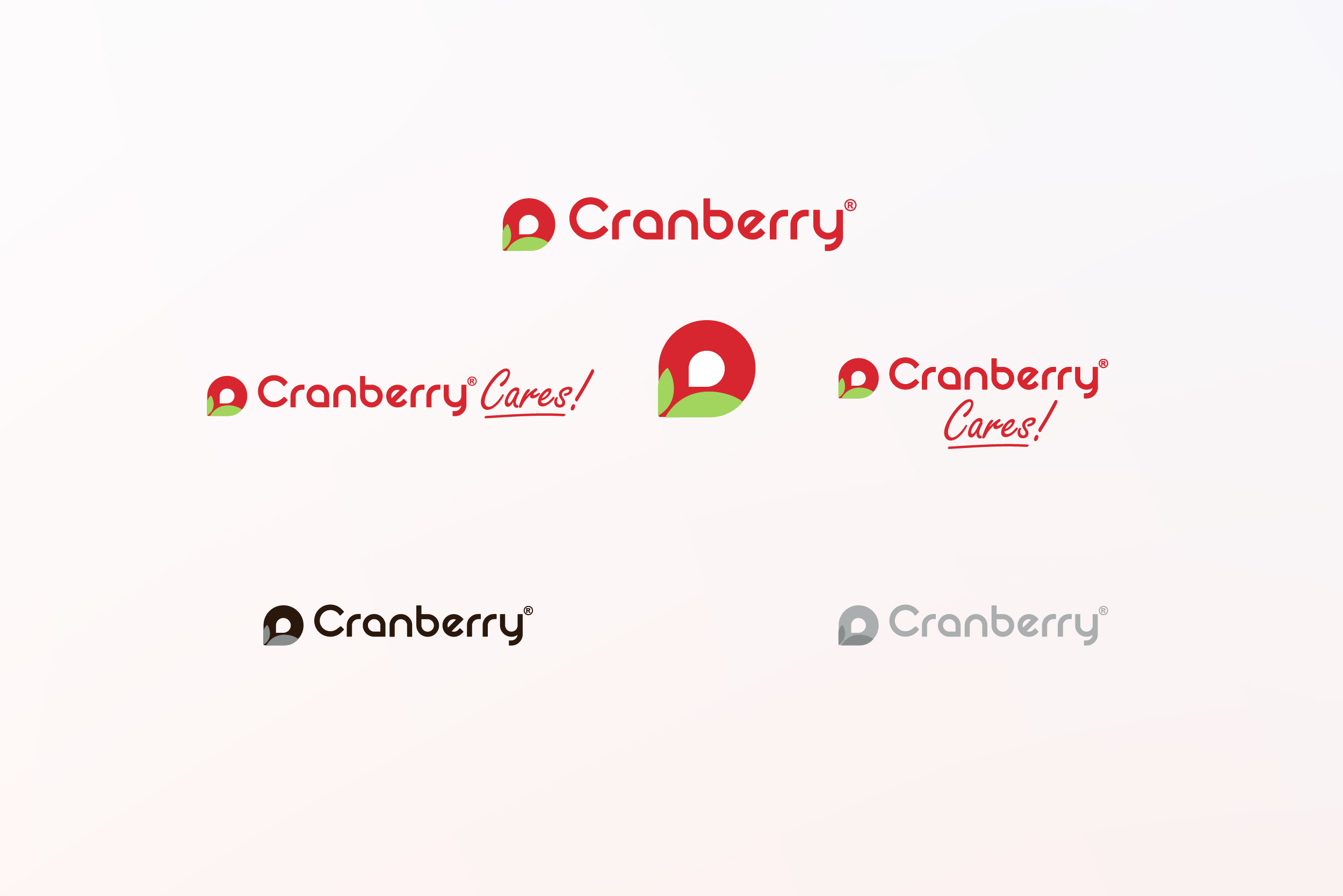
The logo modernization kept the custom red wordmark for recognition but replaced the dated cranberry fruit icon with an abstract mark integrated into the letter "a." The result balanced heritage with contemporary simplicity.
Brand Icons:
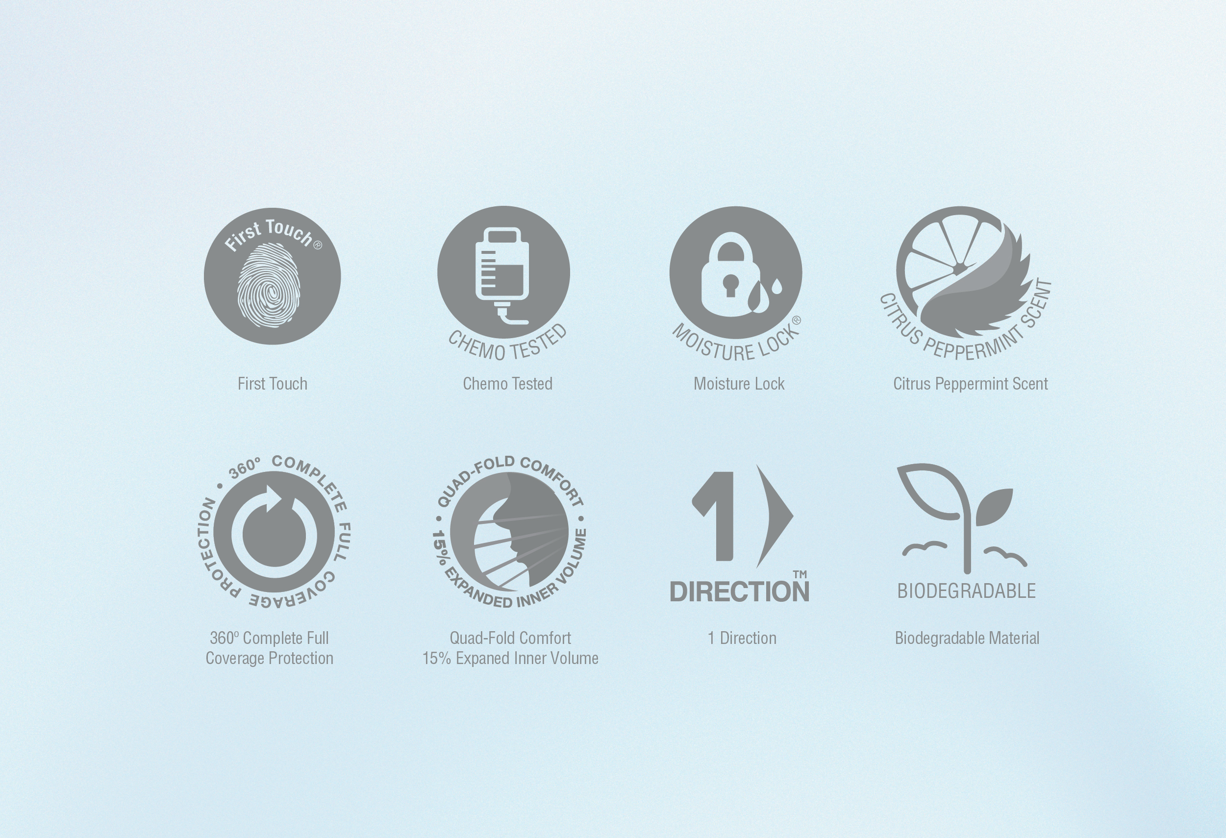
Redesigned the complete product feature icon library to maintain consistency across the packaging system while improving legibility at small sizes. Examples include First Touch, Chemo Tested, Moisture Lock, and 360° Protection.
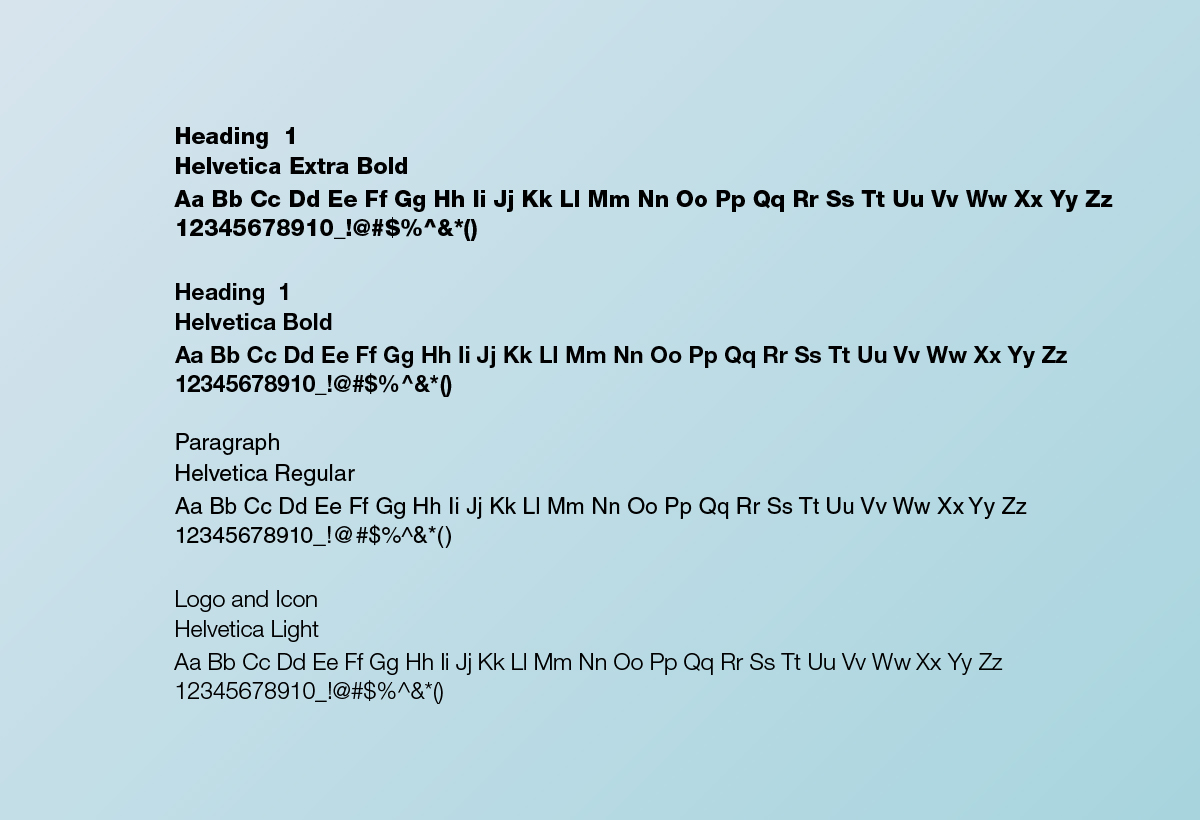
Typography:
Helvetica across all applications for clarity and consistency.
Brand Icons:
Redesigned the complete product feature icon library to maintain consistency across the packaging system while improving legibility at small sizes. Examples include First Touch, Chemo Tested, Moisture Lock, and 360° Protection.
Typography:
Helvetica across all applications for clarity and consistency.
COLOR
PALETTE
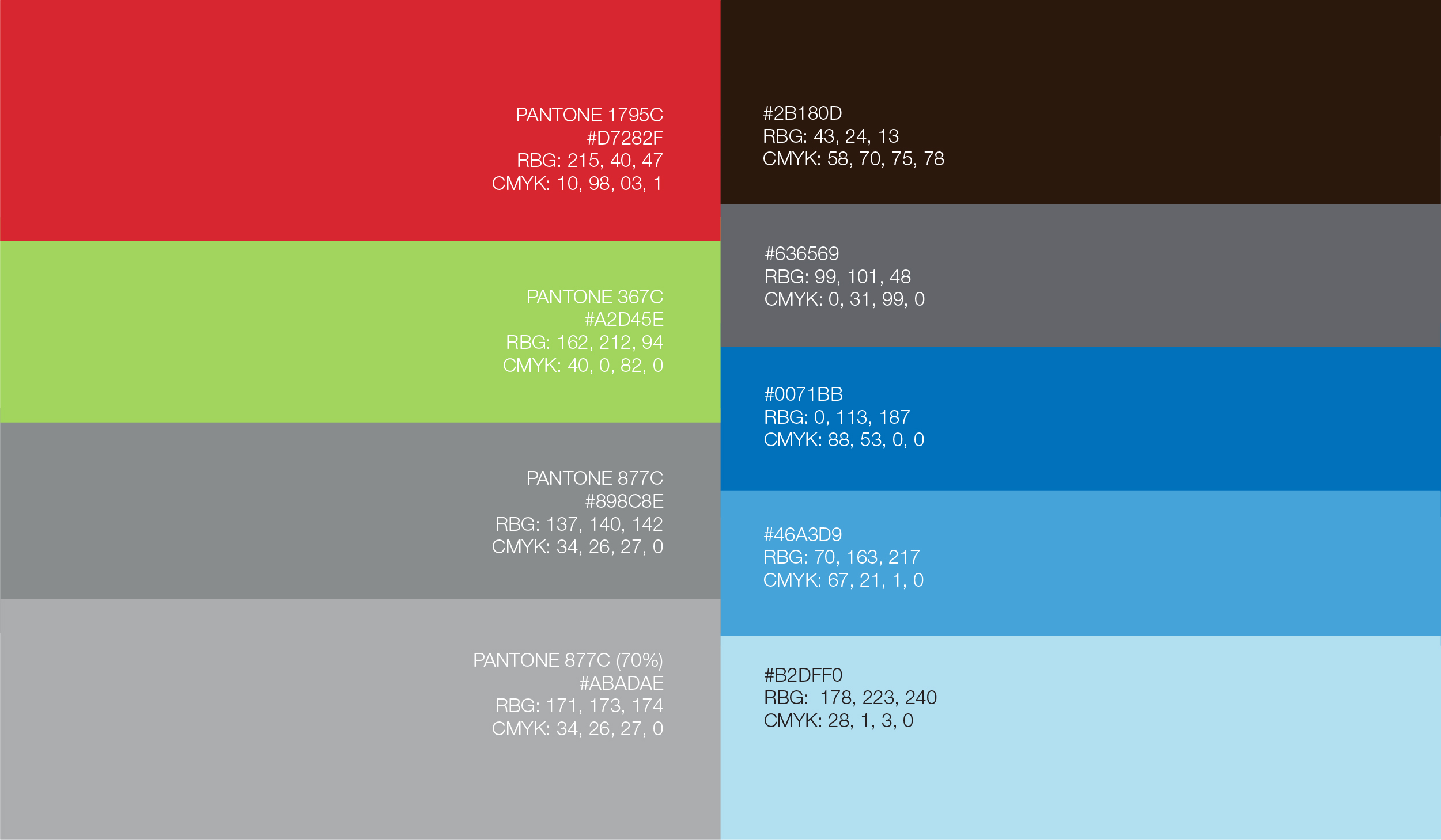
Primary colors:
Signature Red stays bold and recognizable. Trusted Green nods to reliability and growth. Luxurious Silver was the new addition, shifting perception toward premium and cutting-edge.
Secondary colors:
Black and Medium Grey for typography and structural elegance. Royal Blue for innovation highlights. Sky Blue and Baby Blue for approachability without sacrificing authority.
MARKETING COLLATERAL
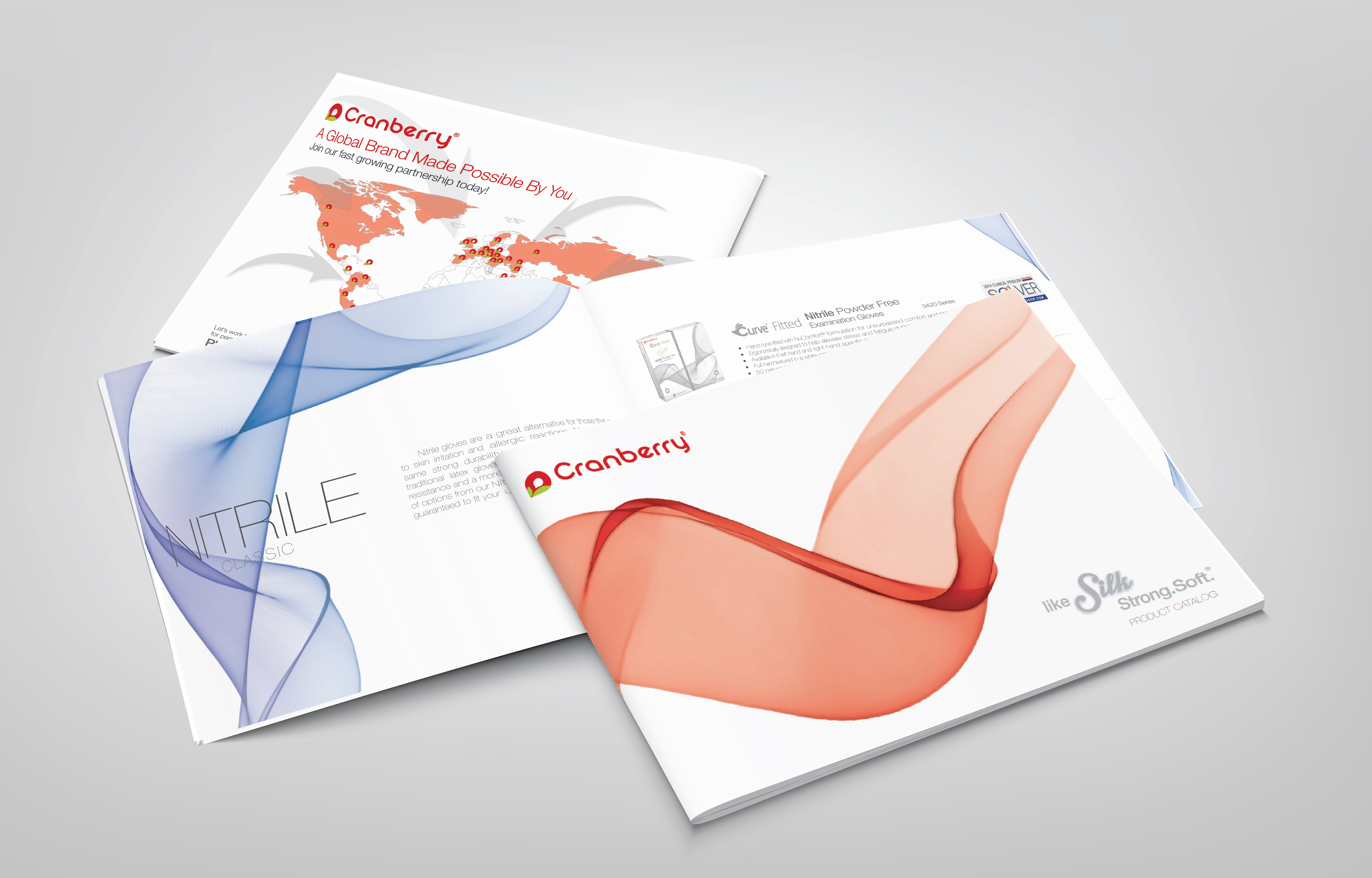
Product Catalog:
Medical catalogs default to information density. Cranberry's prioritized instant clarity and benefit-driven communication. Silk-inspired design mirrored product qualities: strong, soft, unique. Signature red accents reinforced recognition while premium minimalism elevated trust.
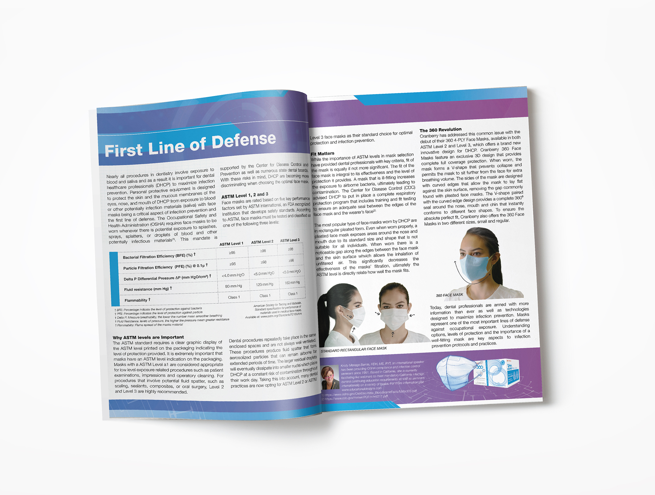
360 Face Mask Article:
This editorial feature marked one of the first deployments of the new visual identity. Clean layouts, strategic purple accents for product differentiation, and user-focused storytelling made technical innovation accessible. The goal was proving advanced PPE could be design-forward, not just functional.
Medical catalogs default to information density. Cranberry's prioritized instant clarity and benefit-driven communication. Silk-inspired design mirrored product qualities: strong, soft, unique. Signature red accents reinforced recognition while premium minimalism elevated trust.
360 Face Mask Article:
This editorial feature marked one of the first deployments of the new visual identity. Clean layouts, strategic purple accents for product differentiation, and user-focused storytelling made technical innovation accessible. The goal was proving advanced PPE could be design-forward, not just functional.
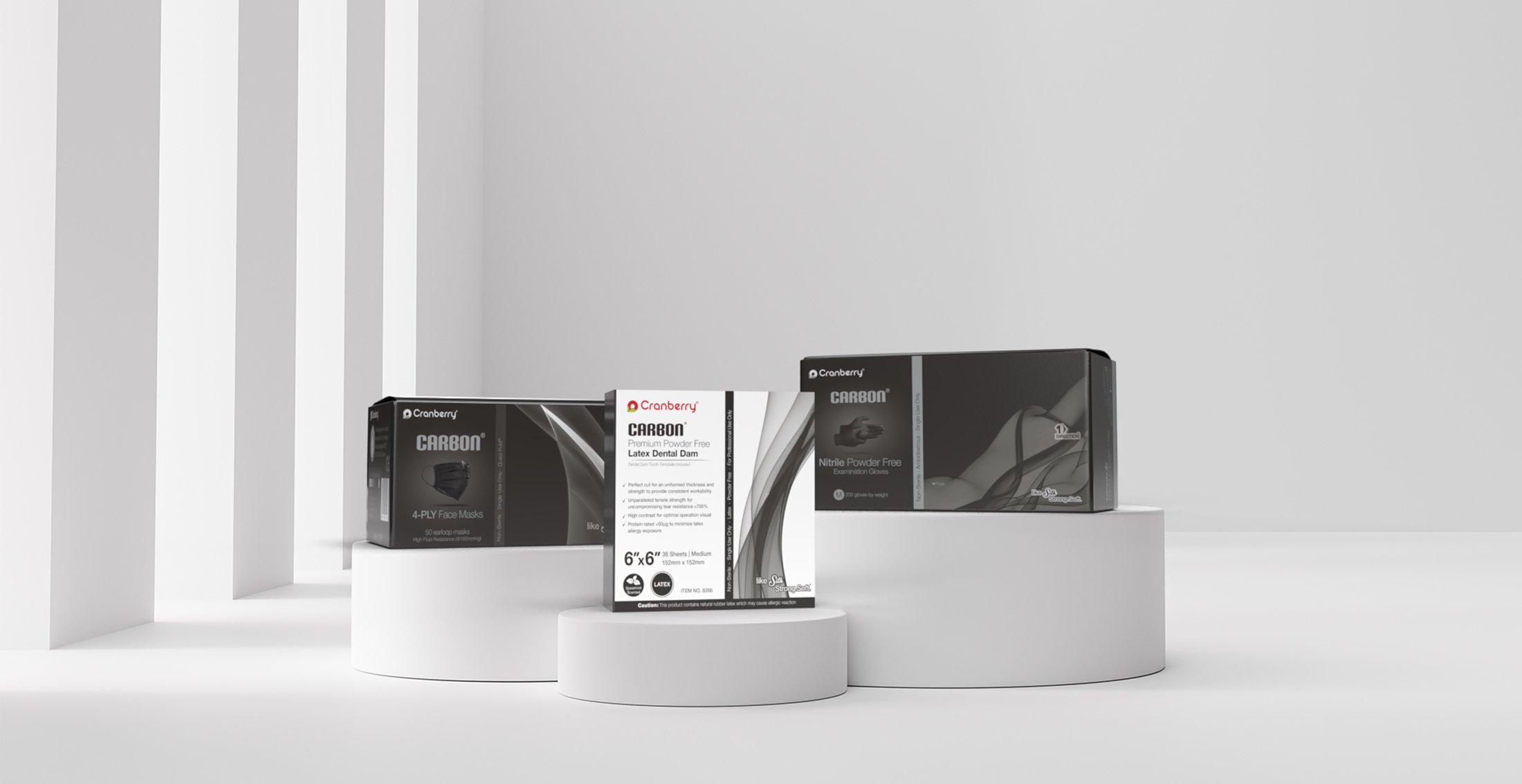
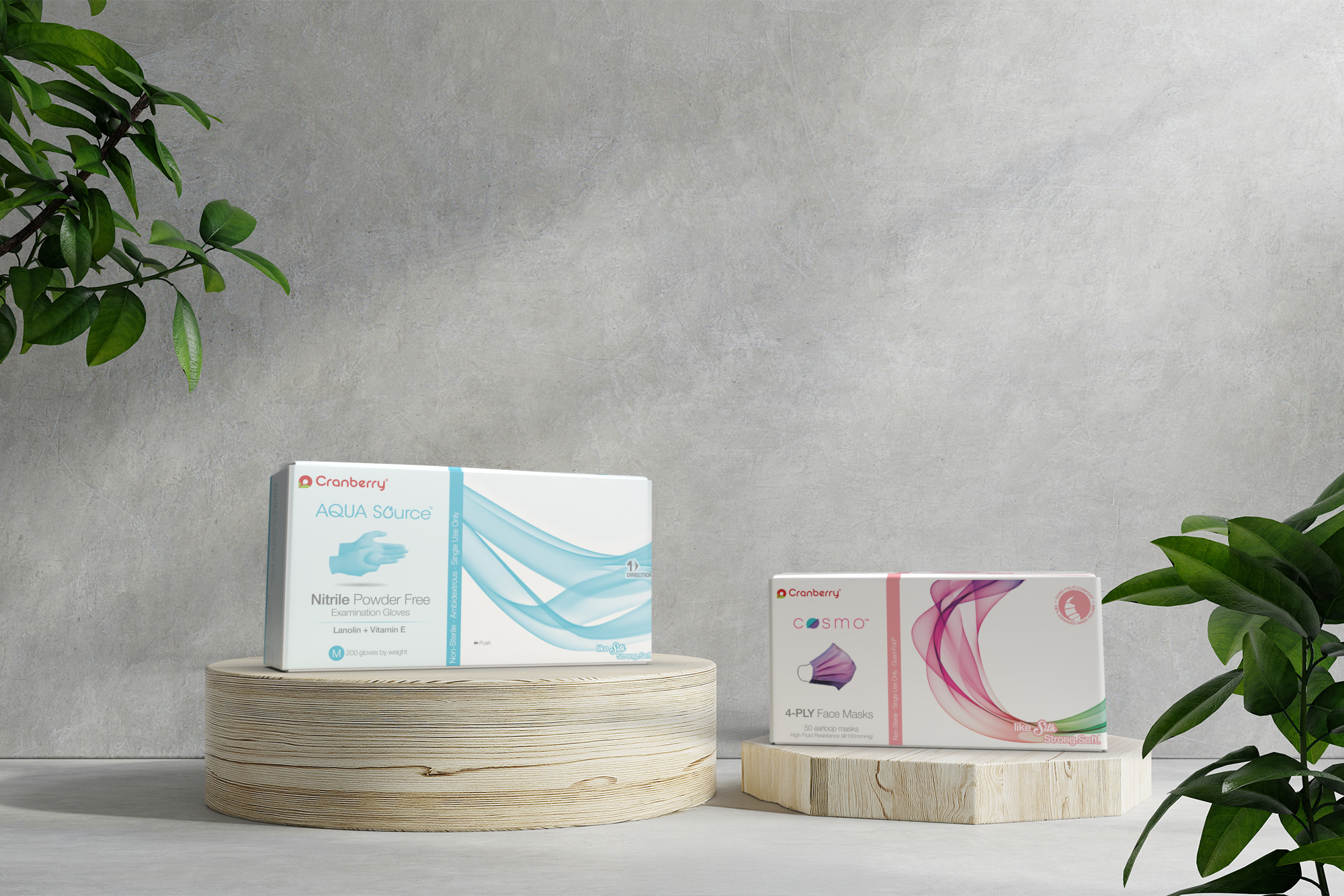
PACKAGING
DESIGN
The packaging redesign launched the rebrand and set creative standards for future product lines. Premium minimalism with clean white backgrounds and bold red accents created shelf impact. Silk-inspired tactile finishes communicated sophistication. User-first hierarchy made benefits immediately clear.
Packaging is the first physical interaction customers have with the brand. It had to establish Cranberry's elevated market position, create instant recognition across product lines, and reflect the same qualities as the products themselves.
View the Production Systems case study →
Packaging is the first physical interaction customers have with the brand. It had to establish Cranberry's elevated market position, create instant recognition across product lines, and reflect the same qualities as the products themselves.
View the Production Systems case study →
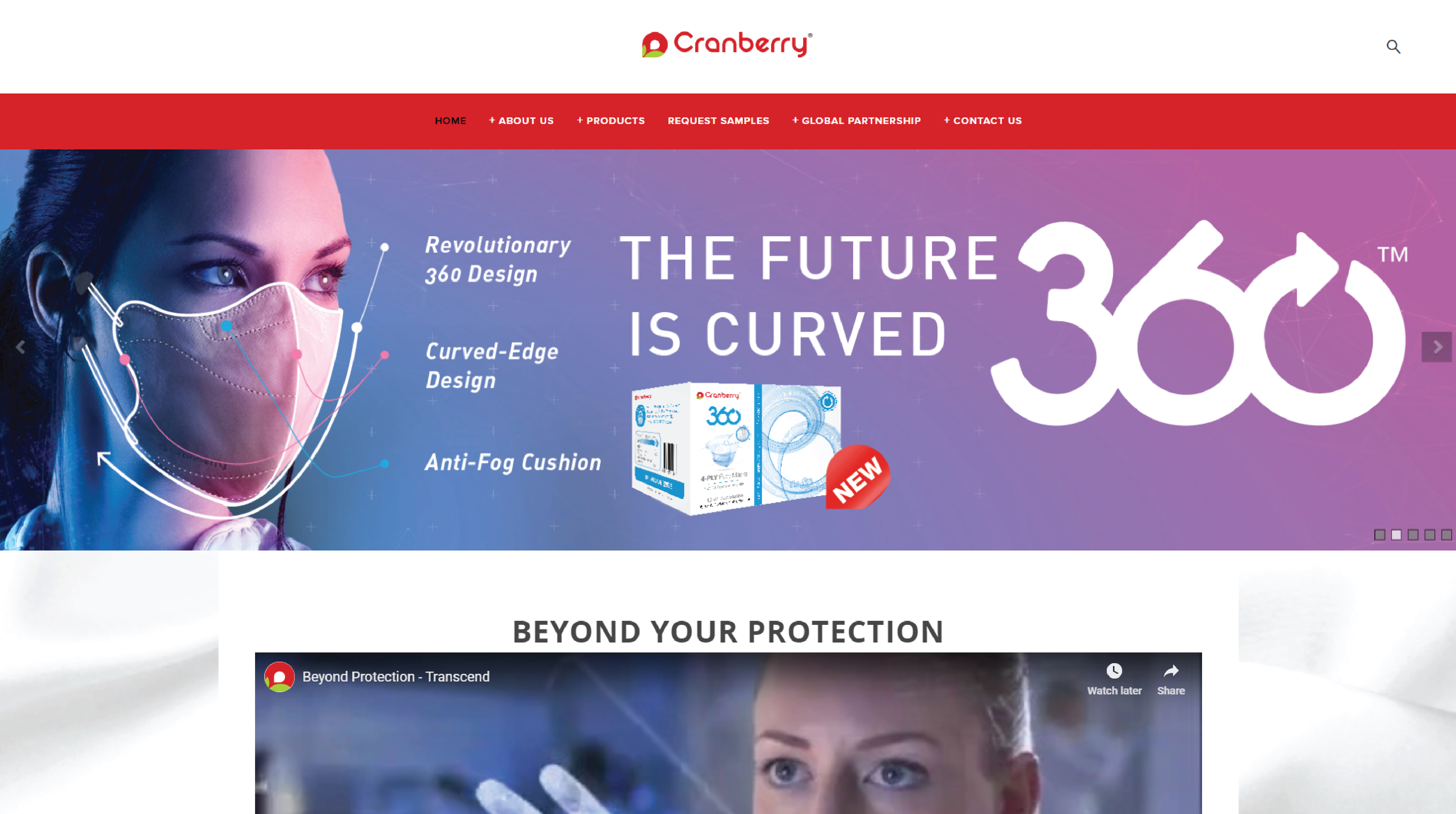
WEB DESIGN
www.cranberryusa.com
The redesigned website (launched 2015, active through 2024) reflected the new visual identity with cleaner layouts, updated color palette, and organized product presentation aligned with the rebrand direction.
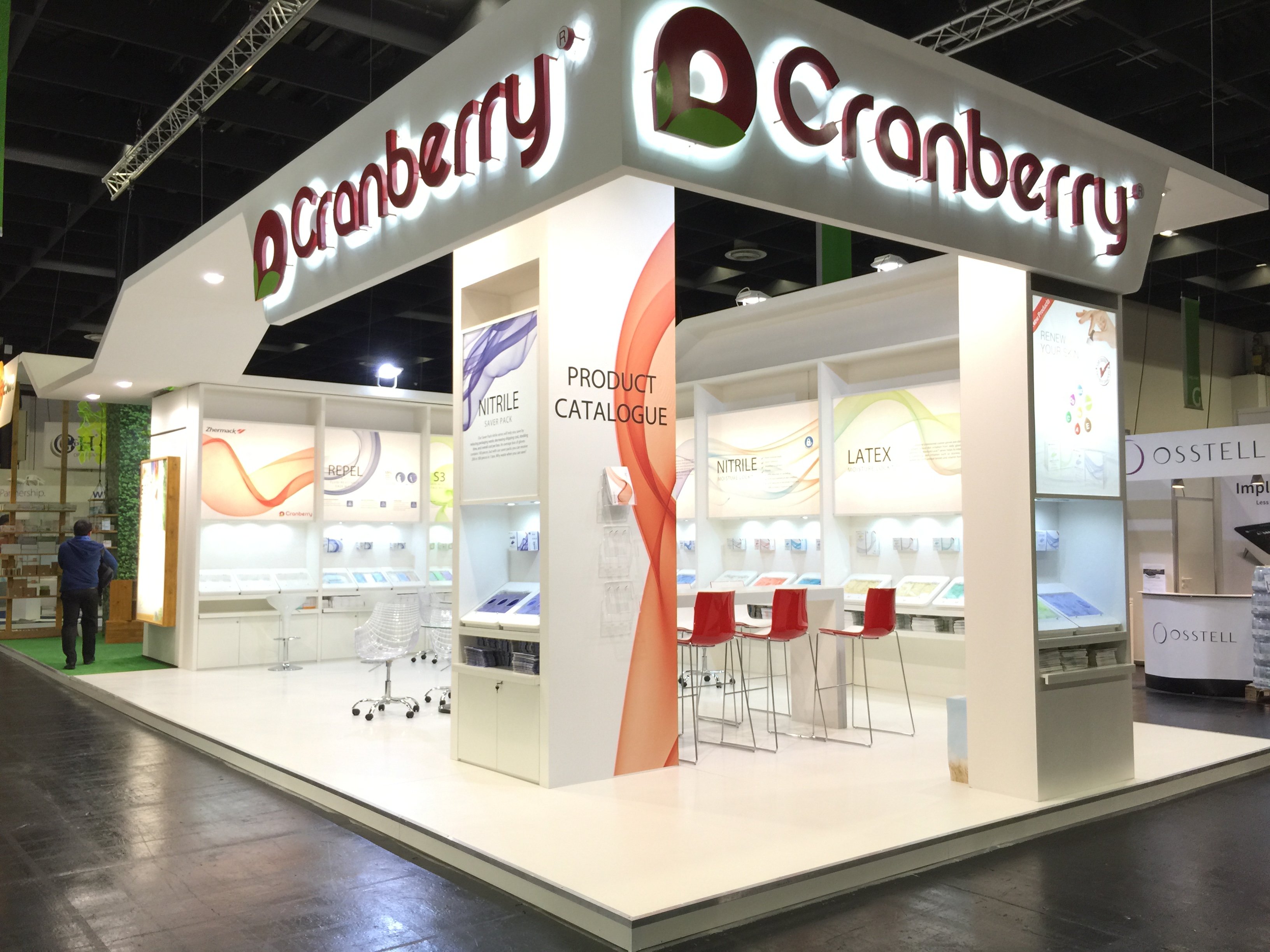
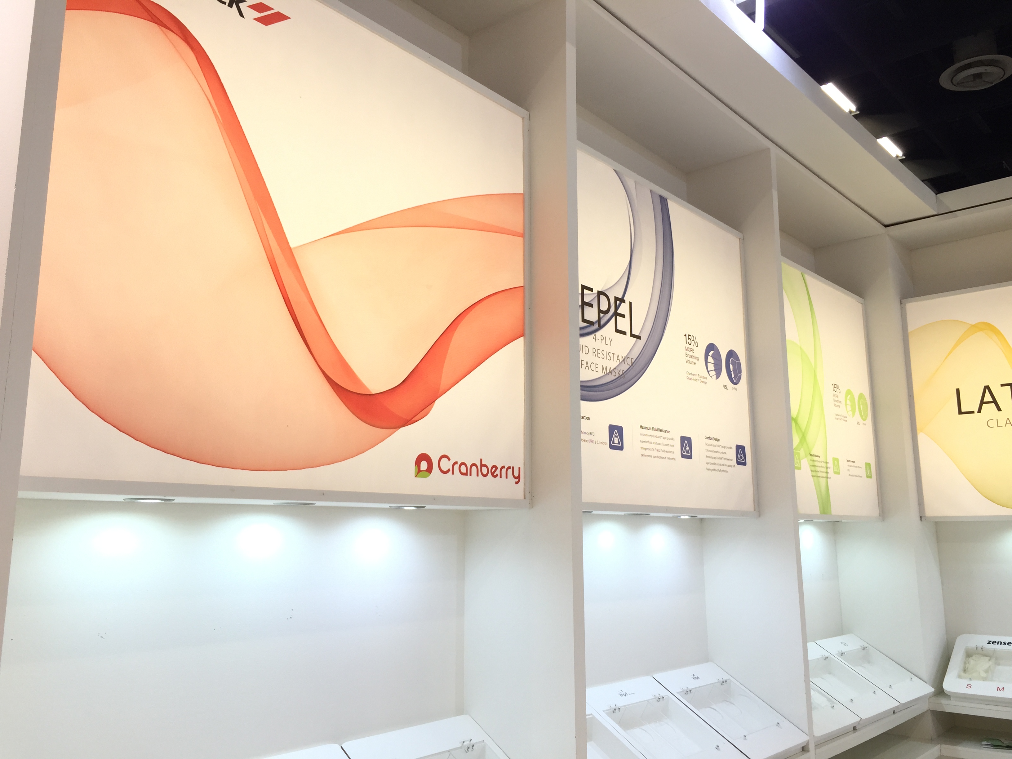
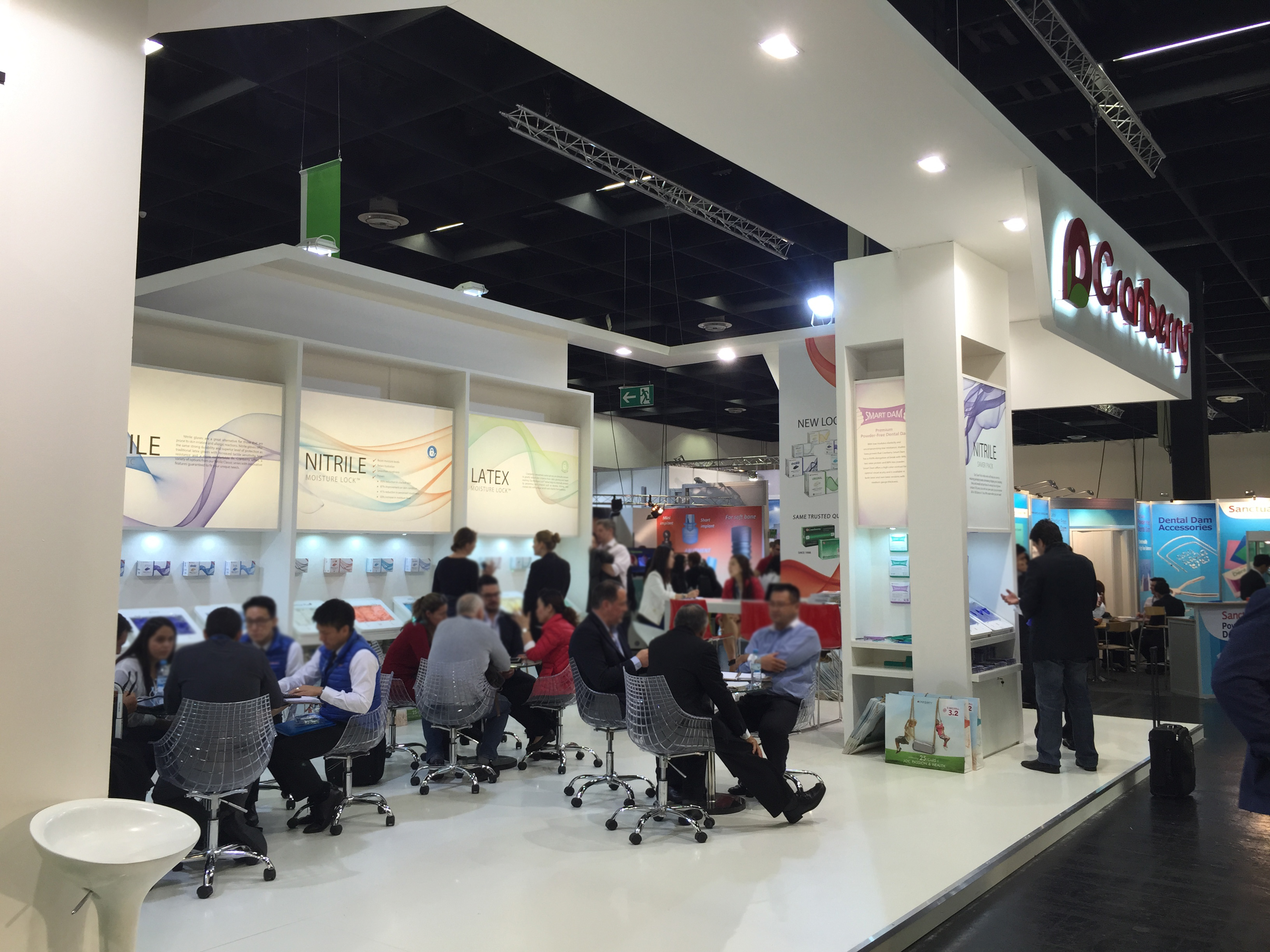
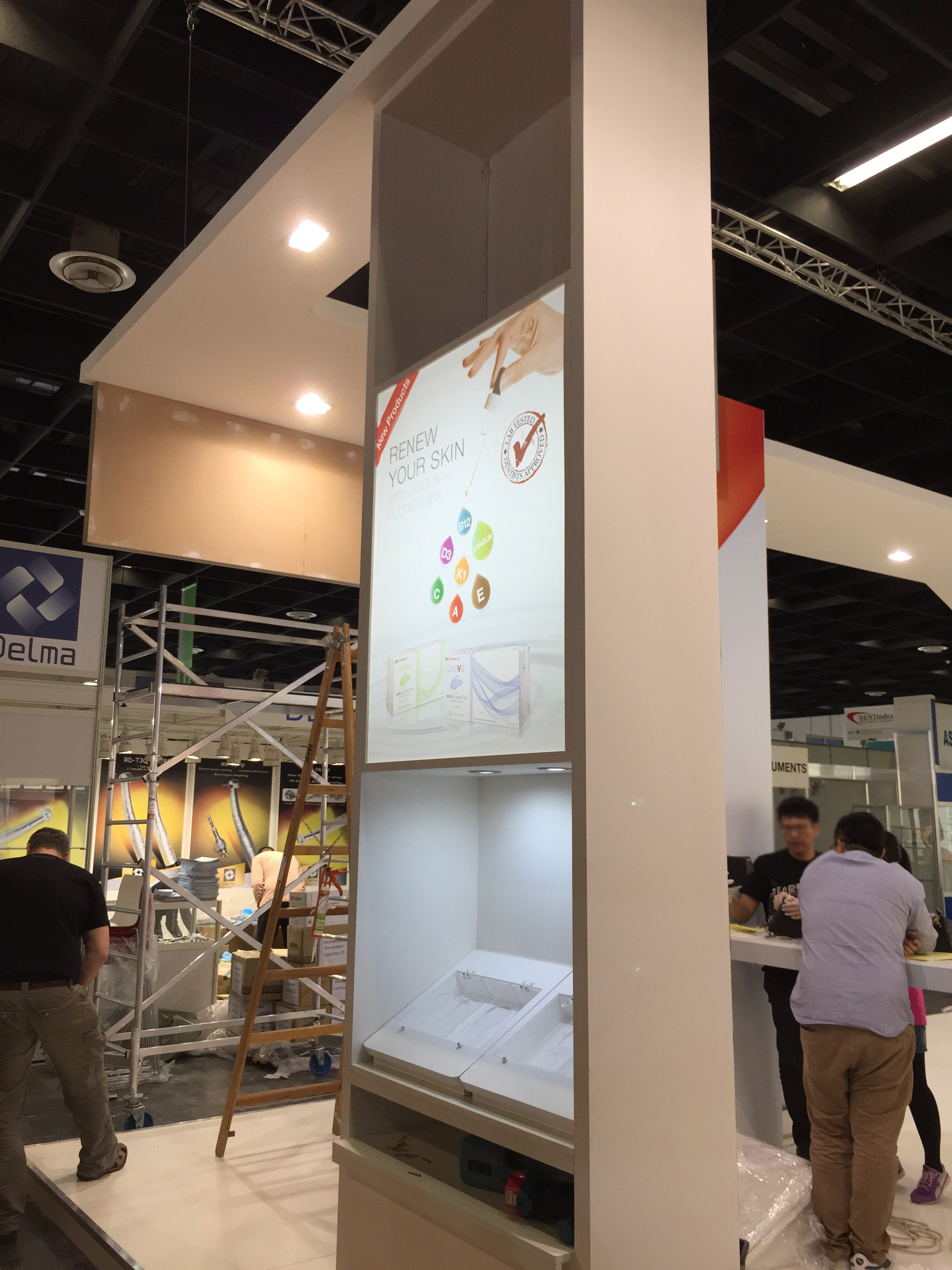
BOOTH
GRAPHIC
DESIGN
From 2016 to 2024, Cranberry's IDS presence showcased heritage as a trusted infection control leader. Bold red backdrops ensured visibility in crowded expo halls. Functional layouts prioritized product demonstrations and professional consultations. Messaging focused on clinical reliability and dental-specific solutions.
This foundation informed the evolved approach seen in Cranberry 2.0's booth design.
This foundation informed the evolved approach seen in Cranberry 2.0's booth design.