
BeeSure 2.0
- Client: BeeSure (2023–Present) | Role: Lead Brand Designer
- Scope: Managed 160+ SKUs across brand development & packaging
- Production: International vendor coordination (China, Malaysia, Indonesia)
about the project
BeeSure needed to stop looking like every other clinical medical supply brand. The challenge: create a visual identity that communicates sustainability and warmth without sacrificing the credibility medical professionals demand.
I led the complete brand transformation from logo through packaging, catalogs, and booth design across 160+ SKUs. The work required coordination across product, marketing, and regulatory teams in the US and Malaysia, along with manufacturing partners across Asia, balancing creative ambition with real production constraints like recyclable materials, overseas printing capabilities, and international labeling requirements.
The tension wasn't sustainability versus professionalism. It was making eco-consciousness feel approachable instead of preachy, and making approachability feel legitimate instead of frivolous.
I led the complete brand transformation from logo through packaging, catalogs, and booth design across 160+ SKUs. The work required coordination across product, marketing, and regulatory teams in the US and Malaysia, along with manufacturing partners across Asia, balancing creative ambition with real production constraints like recyclable materials, overseas printing capabilities, and international labeling requirements.
The tension wasn't sustainability versus professionalism. It was making eco-consciousness feel approachable instead of preachy, and making approachability feel legitimate instead of frivolous.
BRAND IDENTITY
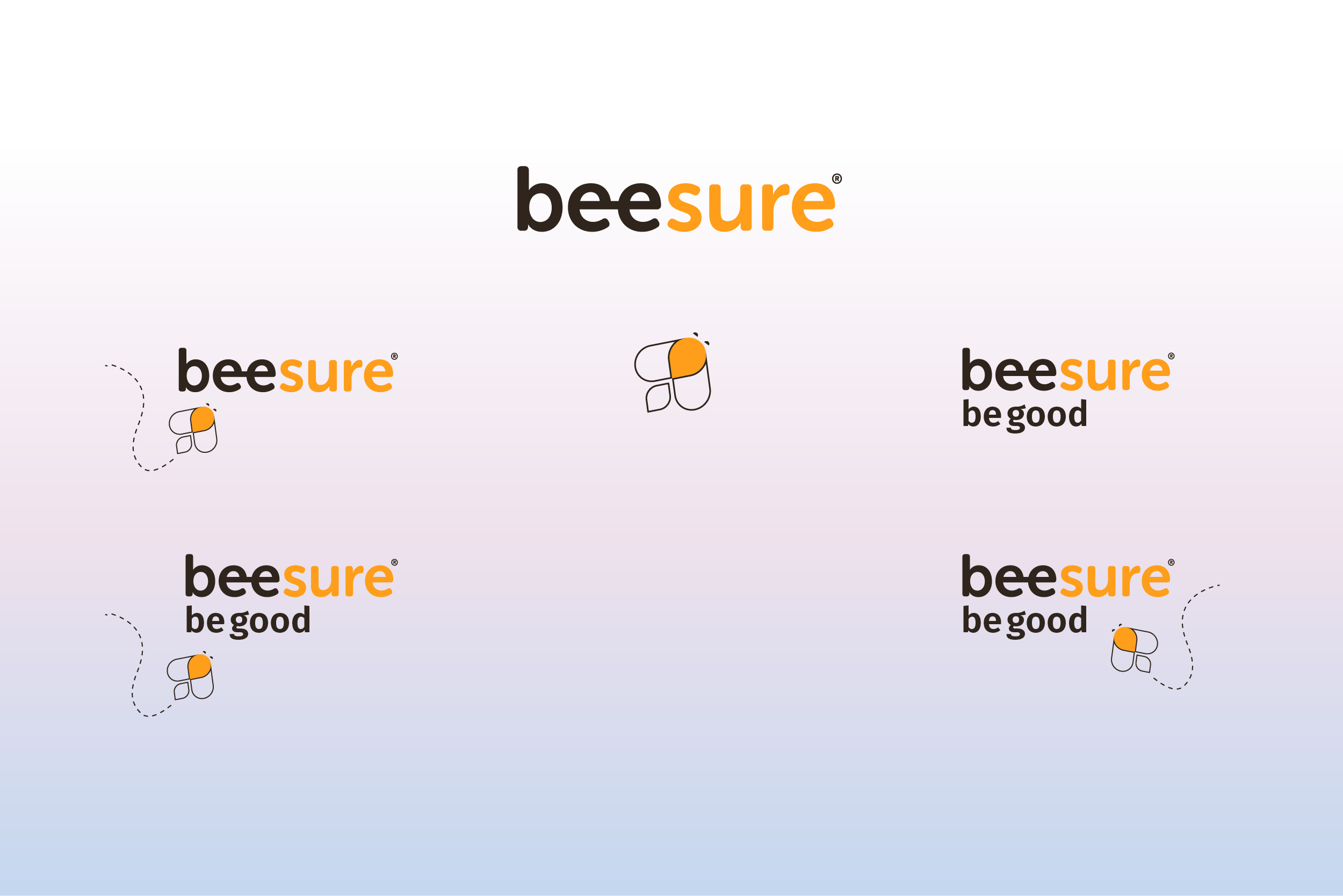
The logo hides a bee in the negative space of the double "e" in "BeeSure." It's subtle enough to avoid feeling gimmicky but distinctive enough to work as a standalone icon for apps and favicons.
The system needed flexibility. The bee icon works independently on small applications, pairs with the wordmark on packaging, and scales from tiny label lockups to 20-foot booth graphics without losing clarity.
Brand Icons:
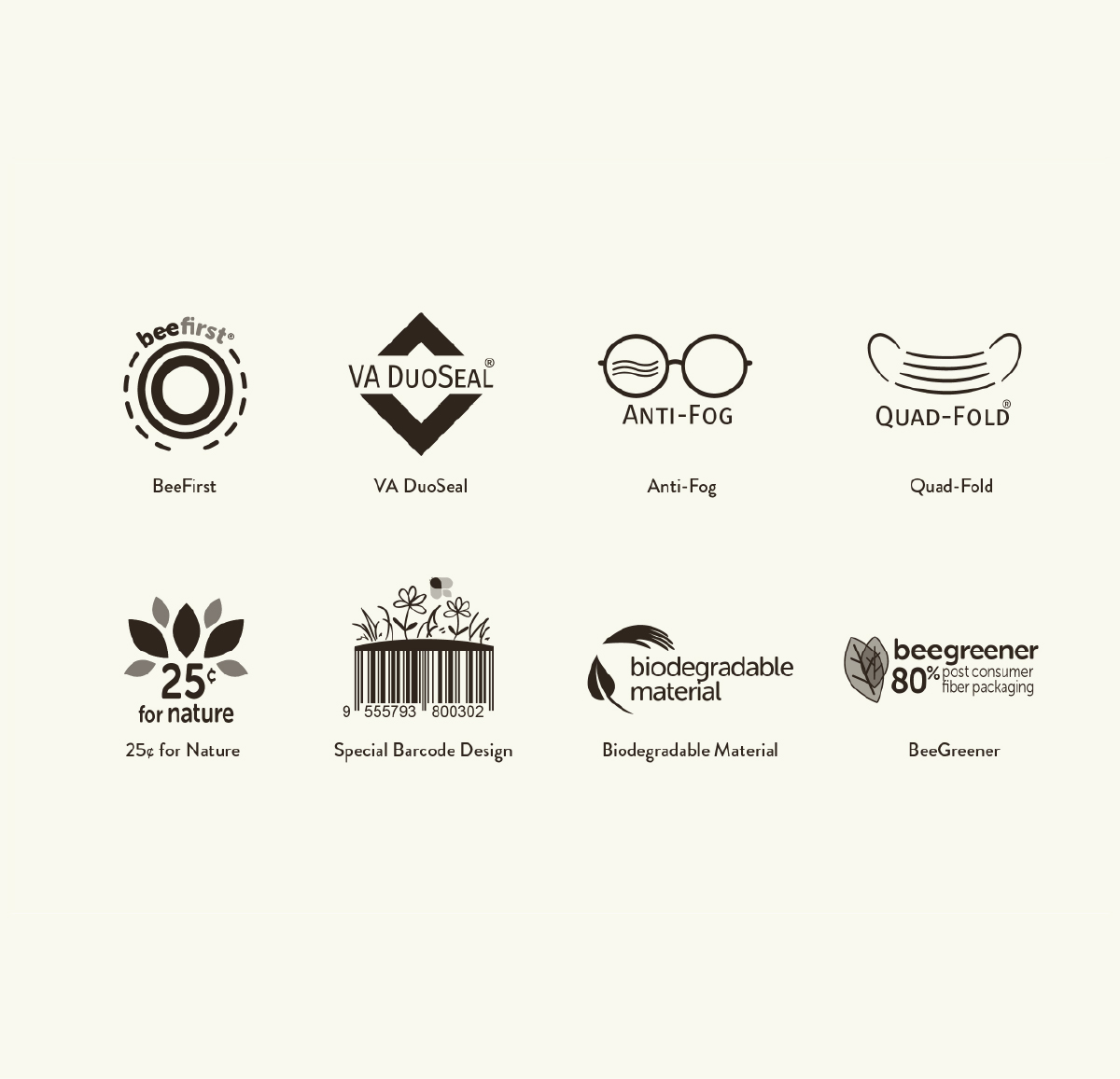
Redesigned the complete product feature icon library to maintain consistency across the packaging system while improving legibility at small sizes. Examples include BeeFirst, VA DuoSeal, Anti-Fog, and Quad-Fold.
Typography:
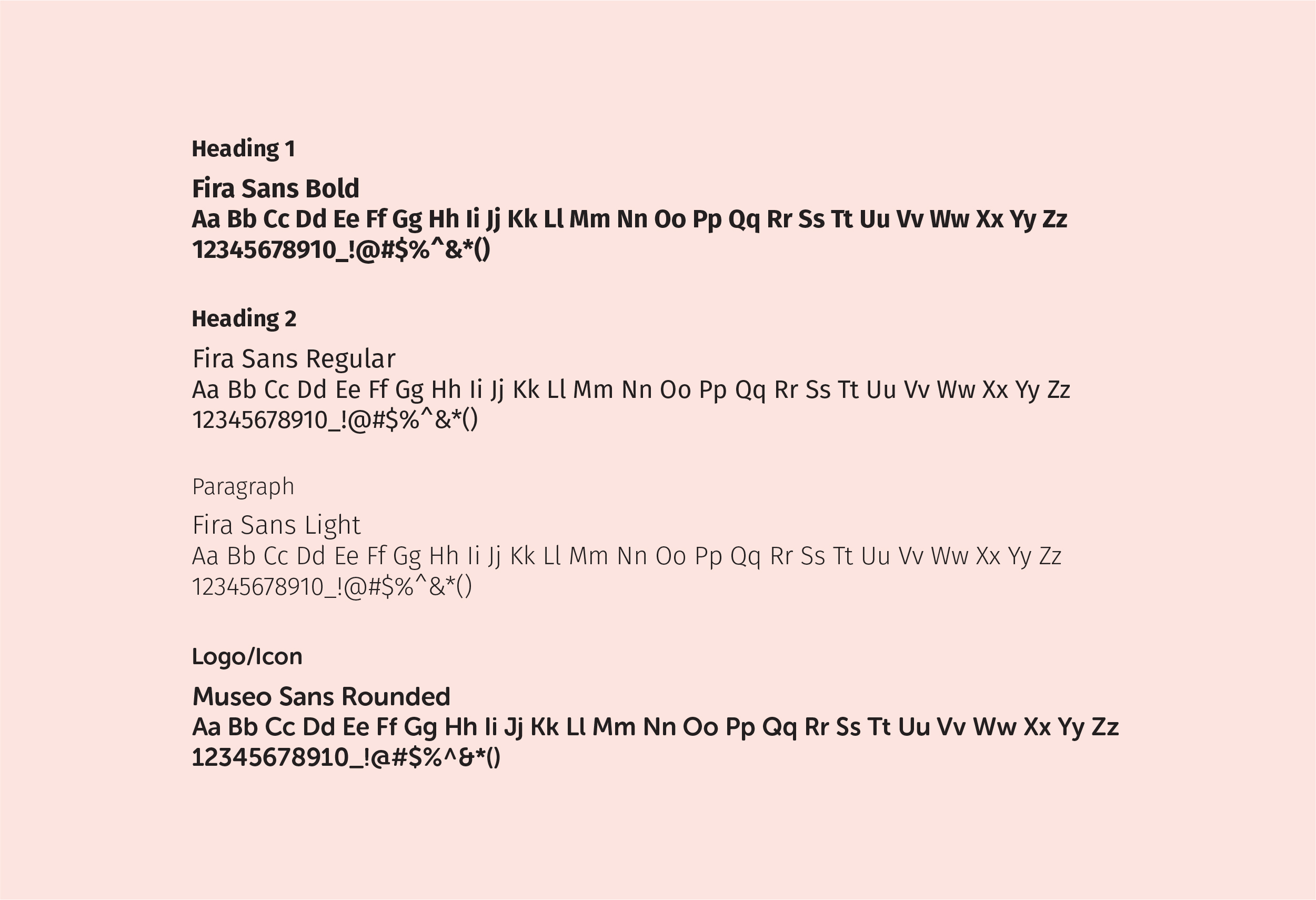
Fira Sans for headlines and body copy, Museo Sans Rounded for logo pairings and selective marketing accents.
The system needed flexibility. The bee icon works independently on small applications, pairs with the wordmark on packaging, and scales from tiny label lockups to 20-foot booth graphics without losing clarity.
Brand Icons:
Redesigned the complete product feature icon library to maintain consistency across the packaging system while improving legibility at small sizes. Examples include BeeFirst, VA DuoSeal, Anti-Fog, and Quad-Fold.
Typography:
Fira Sans for headlines and body copy, Museo Sans Rounded for logo pairings and selective marketing accents.
COLOR PALETTE
- Primary colors:
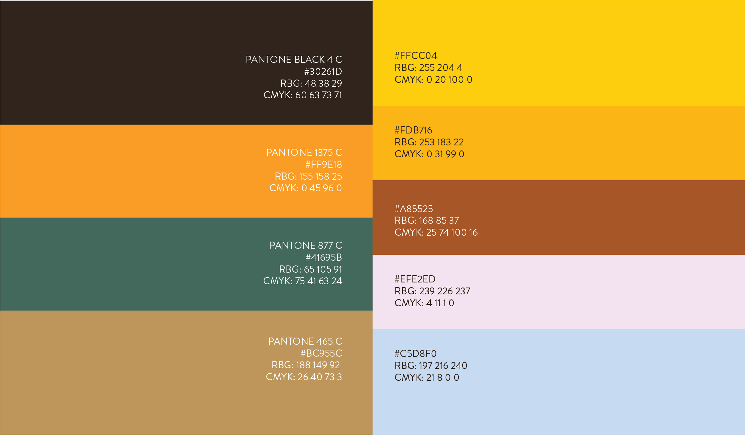
The palette needed to feel organic without looking like a farmers market. Earthy Blackish Brown anchors with sophistication. Bee Orange brings energy without screaming. Forest Green signals growth and reliability. Soft Muddy Brown adds warmth and balance.
Secondary colors:
Bee Yellow, Goldenrod Yellow, Redwood Brown, Light Pink, and Cornflower Blue provide flexibility for different product lines and applications without diluting the core identity.

MARKETING COLLATERAL
Product Catalog:
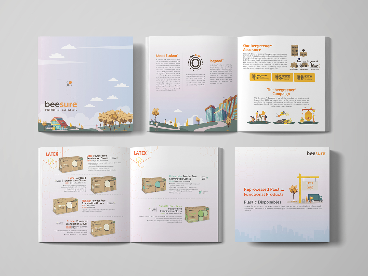
Medical catalogs tend to be dense and clinical. BeeSure's catalog needed to prioritize navigation over information density. Clean layouts, user-first product descriptions, and visible eco-impact metrics made sustainability tangible instead of abstract. The warm aesthetic balances professionalism with approachability.
Radiant Series Sales Sheet:
The Radiant face mask sheet applies the refreshed visual identity with honeycomb patterns, honey yellows, and earthy neutrals. Clean typography ensures quick scanning while reinforcing both performance and sustainability messaging.
Medical catalogs tend to be dense and clinical. BeeSure's catalog needed to prioritize navigation over information density. Clean layouts, user-first product descriptions, and visible eco-impact metrics made sustainability tangible instead of abstract. The warm aesthetic balances professionalism with approachability.
Radiant Series Sales Sheet:
The Radiant face mask sheet applies the refreshed visual identity with honeycomb patterns, honey yellows, and earthy neutrals. Clean typography ensures quick scanning while reinforcing both performance and sustainability messaging.
PACKAGING DESIGN
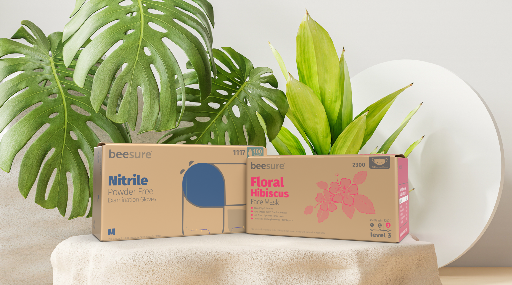
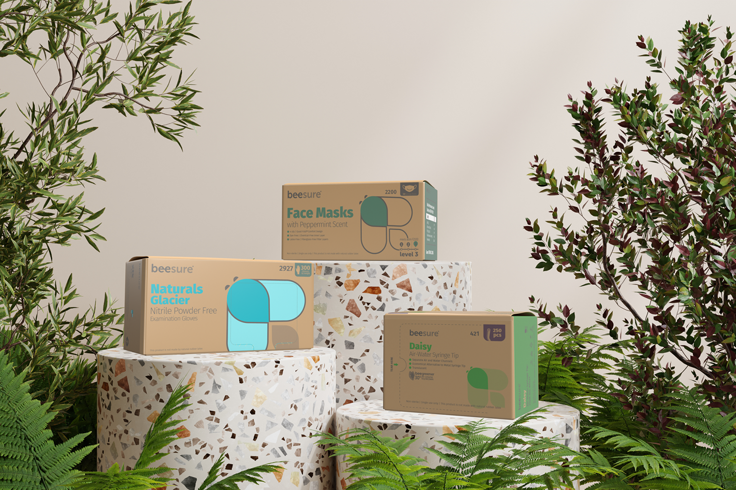
The packaging redesign launched BeeSure's brand evolution. It established the visual language and sustainable ethos that now defines every customer touchpoint.
Design decisions weren't just aesthetic. Selecting recyclable materials, testing matte versus gloss finishes for durability, and simplifying dielines so overseas factories could print faster with fewer errors all shaped the final system. Warm, earthy backgrounds, playful yet professional bee mascot illustrations, and bold but balanced typography prioritize clarity over clutter.
This wasn't just new boxes. It was building a system that production teams across multiple countries could execute consistently while maintaining the brand's sustainability commitments.
View the Floral Design Systems case study →
View the Production Systems case study →
Design decisions weren't just aesthetic. Selecting recyclable materials, testing matte versus gloss finishes for durability, and simplifying dielines so overseas factories could print faster with fewer errors all shaped the final system. Warm, earthy backgrounds, playful yet professional bee mascot illustrations, and bold but balanced typography prioritize clarity over clutter.
This wasn't just new boxes. It was building a system that production teams across multiple countries could execute consistently while maintaining the brand's sustainability commitments.
View the Floral Design Systems case study →
View the Production Systems case study →
MERCHANDISE DESIGN
Extending the BeeSure identity beyond packaging through a collaborative conservation-focused merchandise series
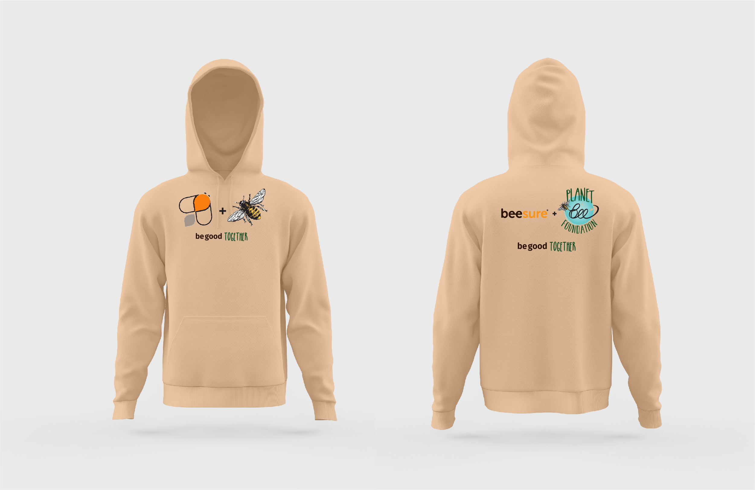
The merchandise series combined BeeSure's visual identity with Planet Bee Foundation's conservation message, creating a playful brand crossover that extended the system into branded merchandise.

BOOTH
GRAPHIC DESIGN
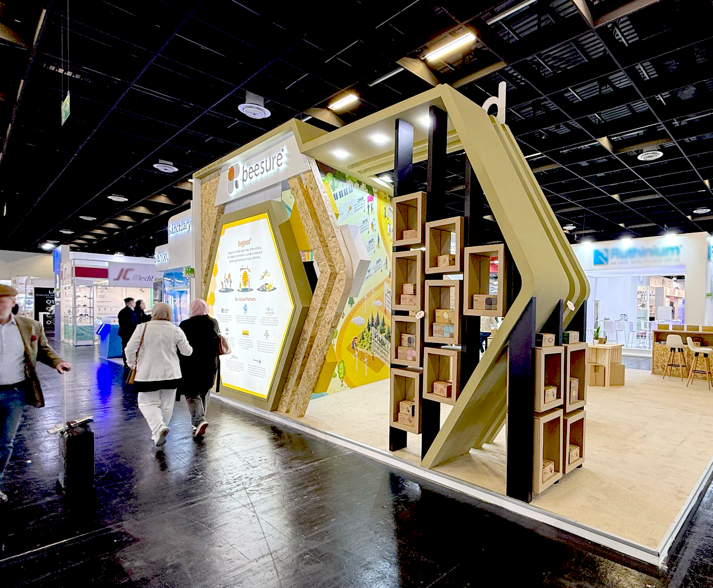
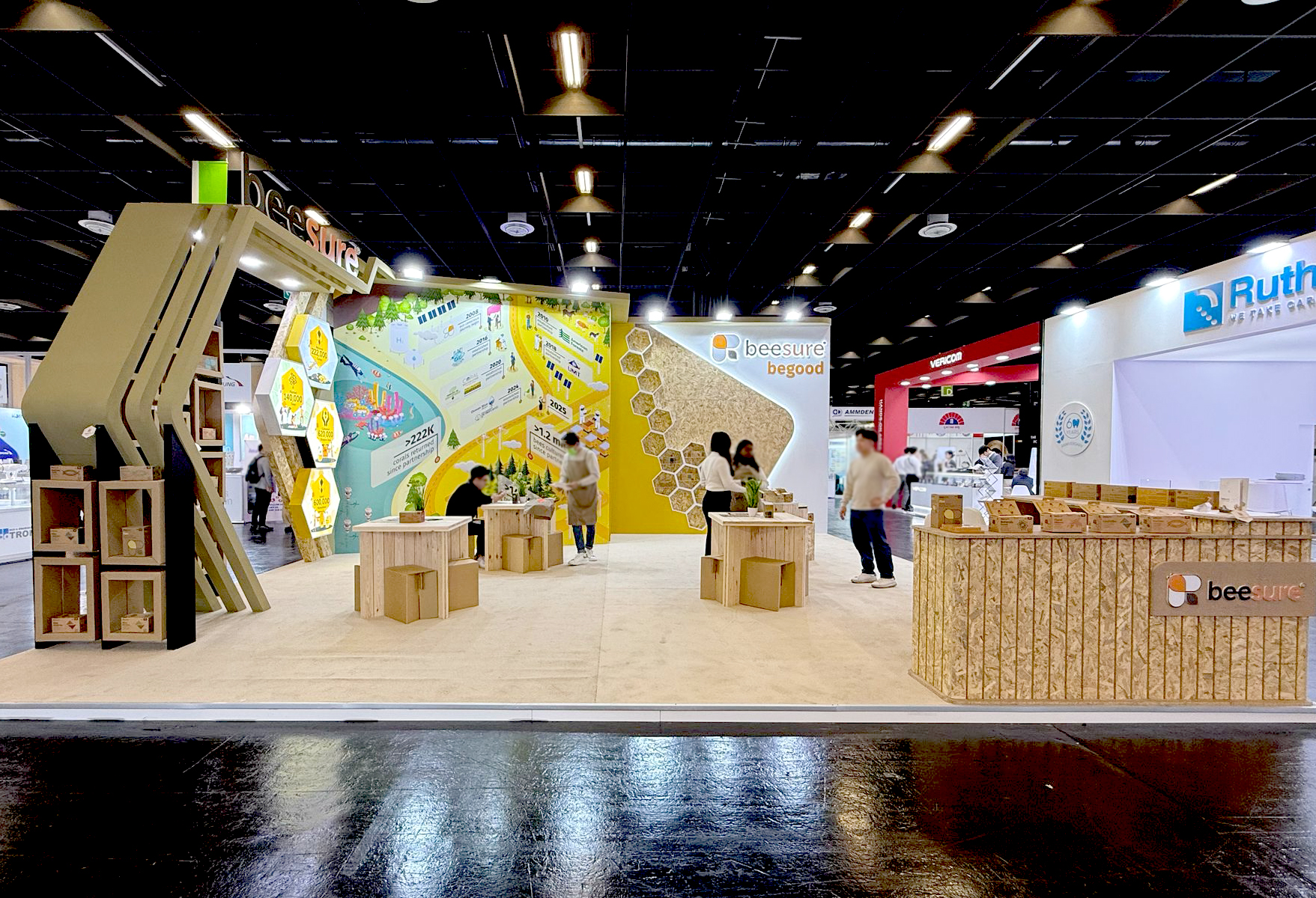
The BeeSure 2.0 identity extended into a modular trade show experience designed to make product education more interactive and approachable. Life-sized product macros highlighted material textures, while dynamic honeycomb patterns, bold color blocking, and layered messaging translated the brand system into a large-scale physical environment.
Information was organized from 10-foot backwall headlines down to detailed product panels, with QR-activated AR product explorers, tactile sample stations, and overhead honeycomb info pods giving visitors multiple ways to discover and compare products.
Information was organized from 10-foot backwall headlines down to detailed product panels, with QR-activated AR product explorers, tactile sample stations, and overhead honeycomb info pods giving visitors multiple ways to discover and compare products.