Trellis
- Client: Trellis Church (2025) | Role: Publication Designer
- Scope: Bilingual devotional calendar design (English/Chinese)
- Role: brand development, creative direction, publication design
about the project
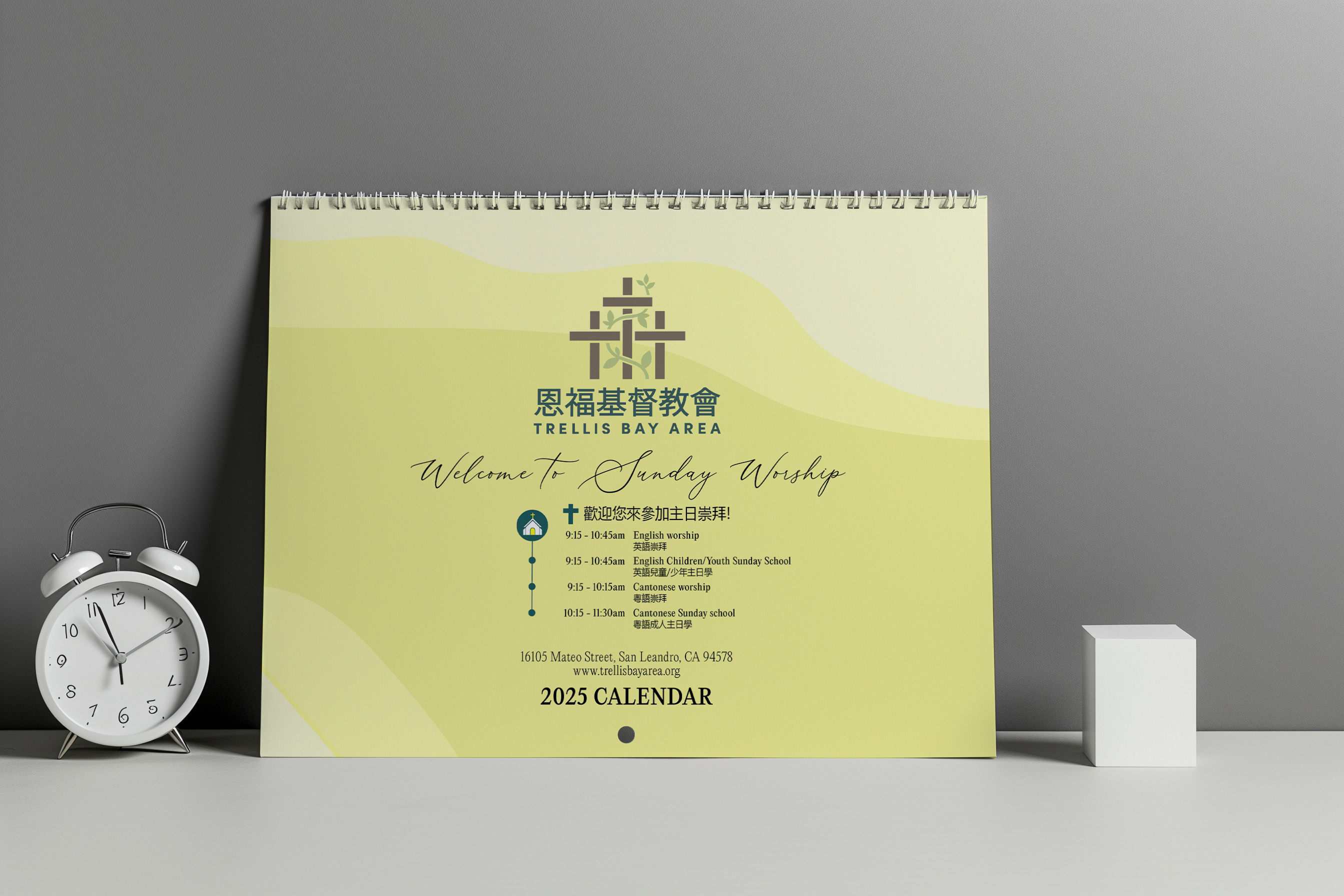
Trellis is a bilingual Christian calendar designed for churches, families, and individuals seeking daily spiritual reflection. The challenge: create something devotional and functional that works equally well in English and Chinese without favoring one language over the other.
I developed the visual system, typographic pairings, illustrations, and layout structure. Each Bible verse needed an illustration that captured its emotional tone while maintaining visual cohesion across 365 days. The design needed to support contemplation, not distract from it.
The tension was balancing two typographically distinct languages (English serif, Chinese sans serif) while maintaining elegance and readability. Every decision prioritized clarity and peace over decoration.
Typography/
COLOR
PALETTE
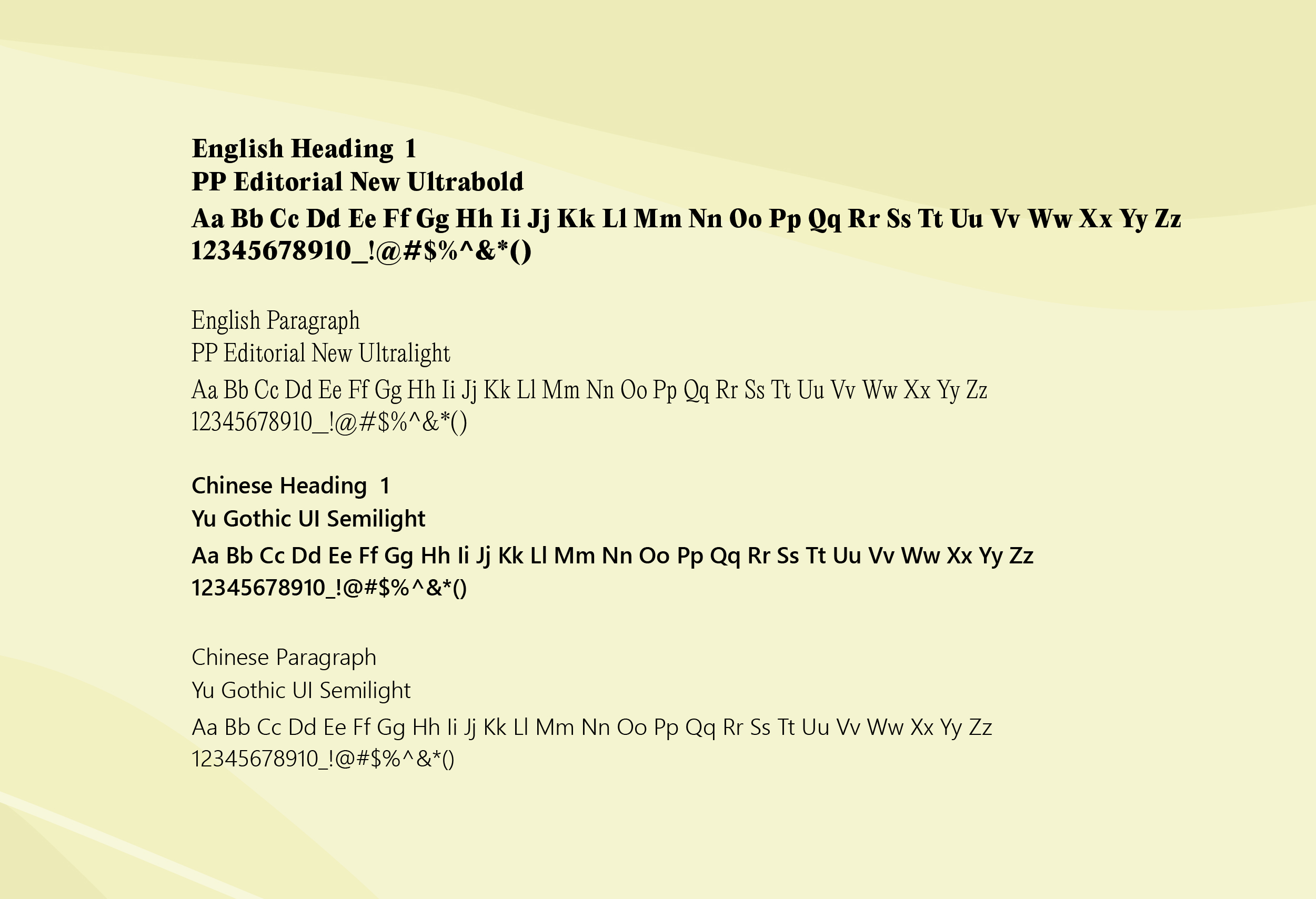
Typography:
PP Editorial New for English (serif warmth and readability), Yu Gothic UI for Chinese (clean sans serif clarity). The pairing balances cultural aesthetics while maintaining visual harmony across both languages.
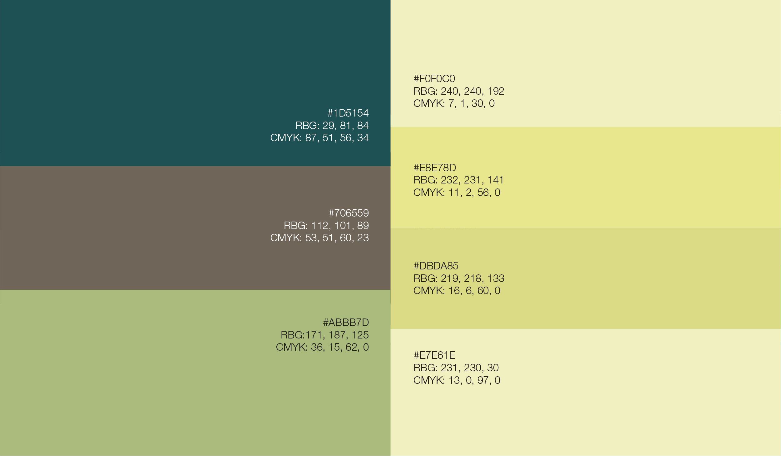
Primary colors:
Teal Blue provides calm, contemplative anchoring. Muted Taupe offers neutral stability for text hierarchy. Sage Green connects to nature-inspired verses and themes of growth.
Secondary colors:
Cream Light for warm backgrounds, Pale Olive for softer accents in reflective spaces, Deeper Olive for emphasis, Golden Mustard for highlighting key liturgical themes.
The palette prioritizes contemplation over decoration, creating visual calm that supports daily reflection.
Calendar
Design
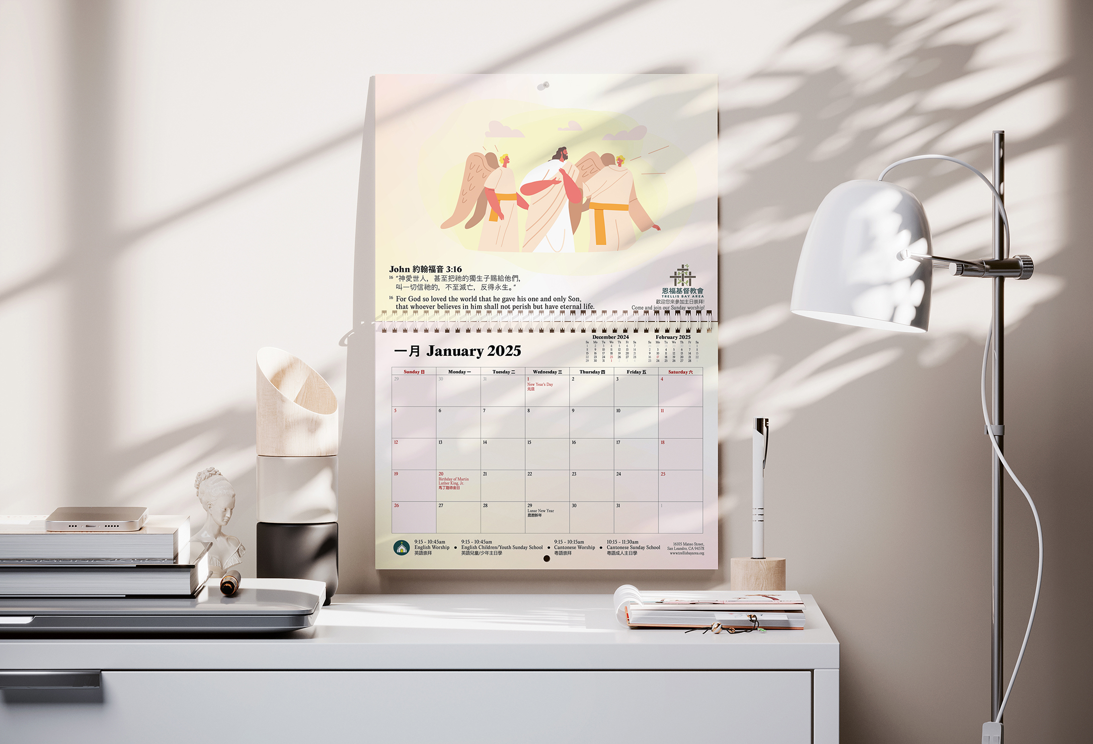
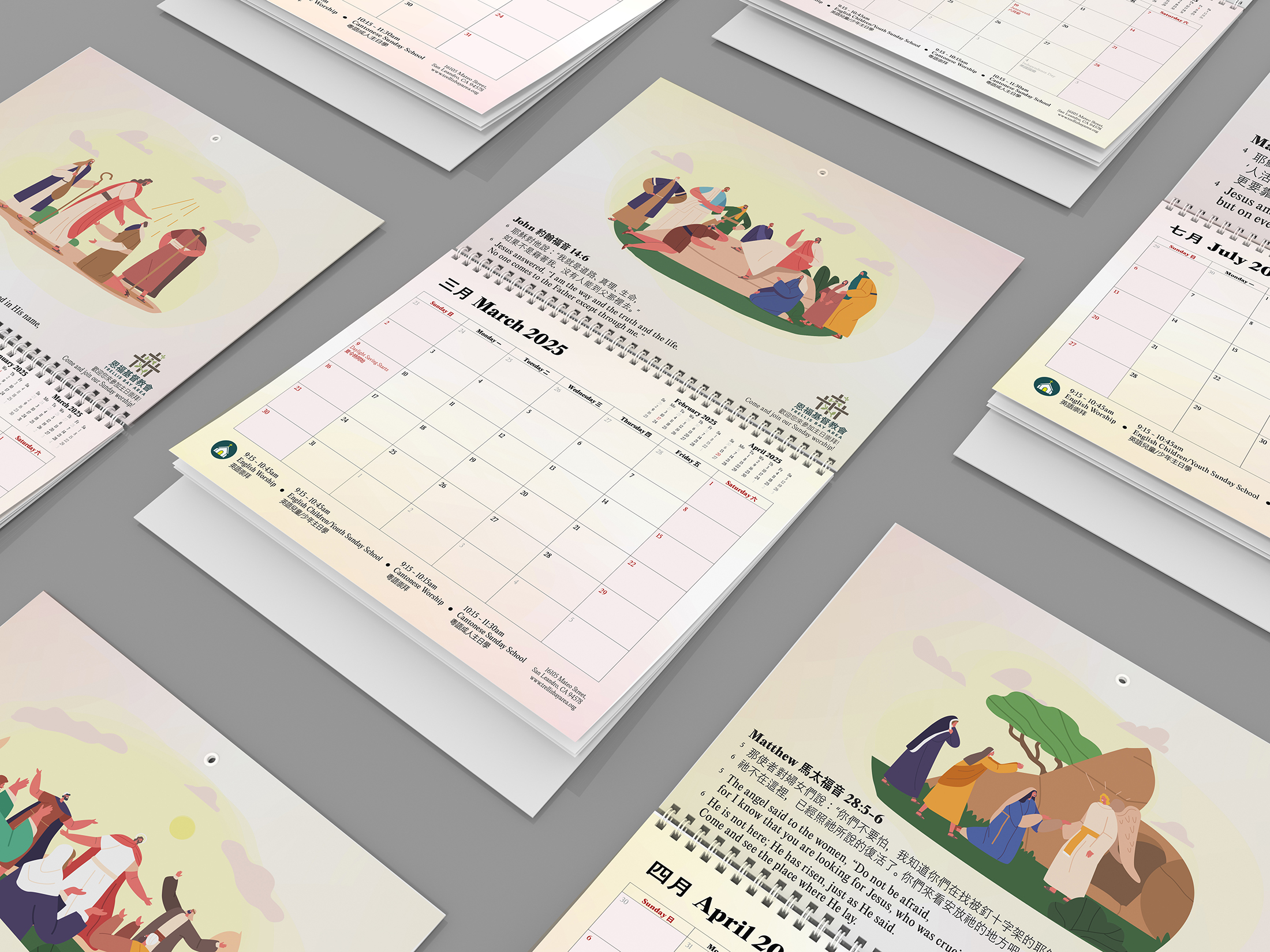
Each page balances functionality with faith. Clean typographic hierarchy, minimalist grids, and warm gold accents create visual rhythm that supports both devotion and daily planning.
Illustrations developed from in-depth research on each selected verse, identifying themes and emotional tones. Minimalist, nature-inspired compositions reflect scriptural messages without breaking visual unity across the calendar.
The final design invites reflection through calm visual pacing, ensuring both languages feel equally considered and neither overwhelms the page.
