
ASAP
- Client: ASAP (2020) | Role: Brand Designer
- Scope: Managed 80+ SKUs across brand development and packaging
- Production: International vendor coordination (China, Malaysia)
about the
project
In 2020, FDA UDI compliance required relabeling every SKU. We used the opportunity to refresh ASAP’s visual identity. The brand positioned itself as “Art & Science,” but the design didn't reflect that philosophy. The challenge was to modernize a workhorse brand serving six industries while coordinating international production and meeting regulatory deadlines.
I led the visual transformation across 80+ SKUs, from logo refinement through packaging, catalogs, and digital marketing. The work coordinated between Malaysia product teams and manufacturing partners across China and Malaysia, balancing creative ambition with production constraints such as FDA compliance and overseas printing.
The trick was creating a visual system that felt specialized for each market, from hospitals to auto shops, without fragmenting the brand. Same brand, same DNA, different needs.
BRAND
IDENTITY
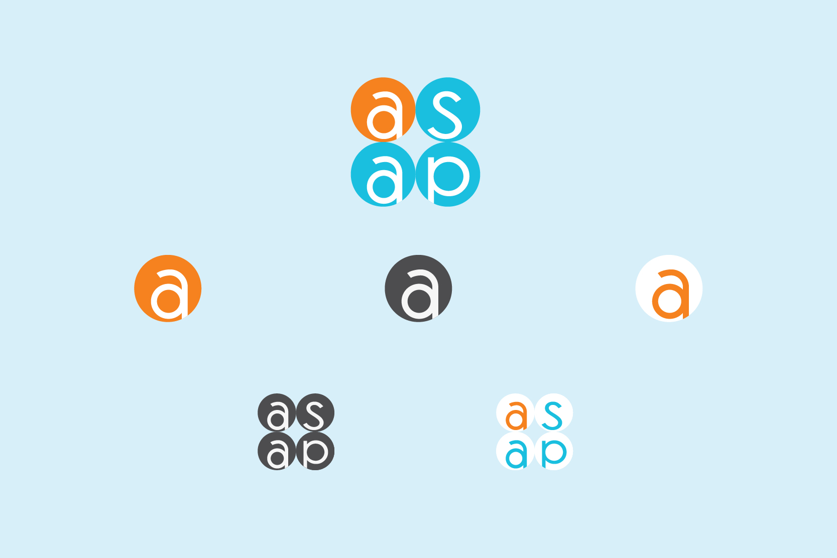
The logo refresh focused on clarity without sacrificing recognition. We refined the letterforms and updated to Code typography, creating sharper geometry while maintaining the familiar ASAP mark.
The identity’s anchor is the Art & Science diagram: overlapping circles (orange for innovation, blue for precision) with ASAP at the intersection. It scales from business cards to booth graphics, reinforcing positioning across touchpoints.
Brand Icons:
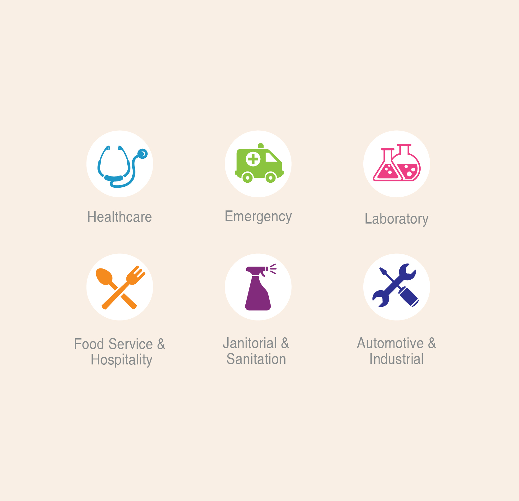
Redesigned the industry icon library for six markets (Healthcare, Emergency, Laboratory, Food Service, Janitorial, Automotive and Industrial). Each market uses distinct color coding for fast navigation while retaining a consistent circular icon structure.
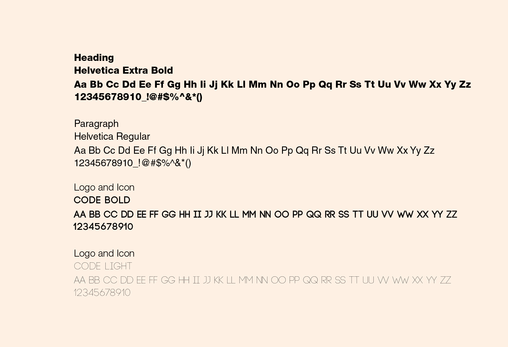
Typography:
Code Light and Bold for headlines and logo applications. Helvetica for body copy and technical specifications.
The identity’s anchor is the Art & Science diagram: overlapping circles (orange for innovation, blue for precision) with ASAP at the intersection. It scales from business cards to booth graphics, reinforcing positioning across touchpoints.
Brand Icons:
Redesigned the industry icon library for six markets (Healthcare, Emergency, Laboratory, Food Service, Janitorial, Automotive and Industrial). Each market uses distinct color coding for fast navigation while retaining a consistent circular icon structure.
Typography:
Code Light and Bold for headlines and logo applications. Helvetica for body copy and technical specifications.
COLOR
PALETTE
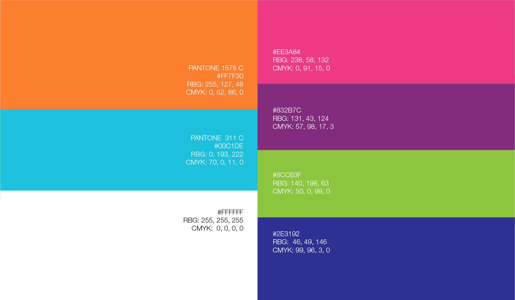
- Primary colors:
Color choices weren’t arbitrary. Vibrant orange signals energy, innovation, and high visibility. Healthcare cyan anchors the system with medical credibility and cleanliness, reflecting ASAP’s core market. Clean white provides clarity and safety: in medical environments, defects and contaminants must be instantly visible under any lighting.
The orange and cyan pairing reinforces the Art & Science positioning while creating strong shelf presence and instant brand recognition across market environments.
Secondary colors:
Magenta pink, purple, lime green, and navy blue serve as industry-specific color coding, enabling instant product differentiation while maintaining a cohesive brand system.
MARKETING
COLLATERAL
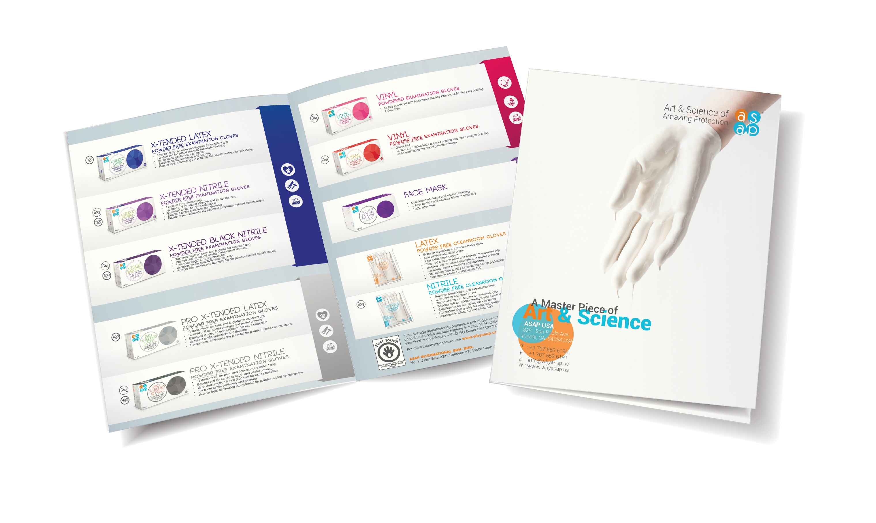
Product Catalog:
Multi-industry catalogs face a navigation problem: six audiences need to find products fast. The solution used industry color coding from the icon system for instant sectioning. Clean layouts and the Art & Science motif maintain cohesion while keeping specs accessible and clinical.
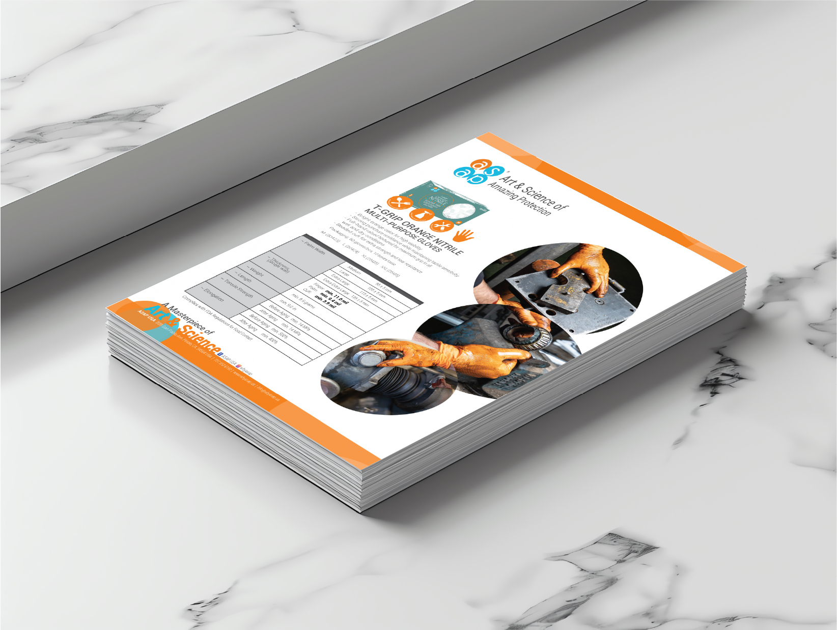
Sales Sheet:
Product sell sheets needed to work across vastly different buying environments, from hospital procurement to auto shop managers. Consistent templates with flexible color application allowed each industry to feel addressed while maintaining professional credibility. Bold product imagery, concise features, and technical specifications balanced approachability with precision.
Multi-industry catalogs face a navigation problem: six audiences need to find products fast. The solution used industry color coding from the icon system for instant sectioning. Clean layouts and the Art & Science motif maintain cohesion while keeping specs accessible and clinical.
Sales Sheet:
Product sell sheets needed to work across vastly different buying environments, from hospital procurement to auto shop managers. Consistent templates with flexible color application allowed each industry to feel addressed while maintaining professional credibility. Bold product imagery, concise features, and technical specifications balanced approachability with precision.

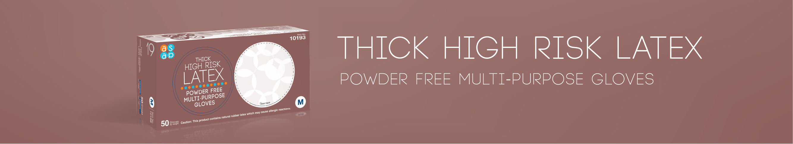
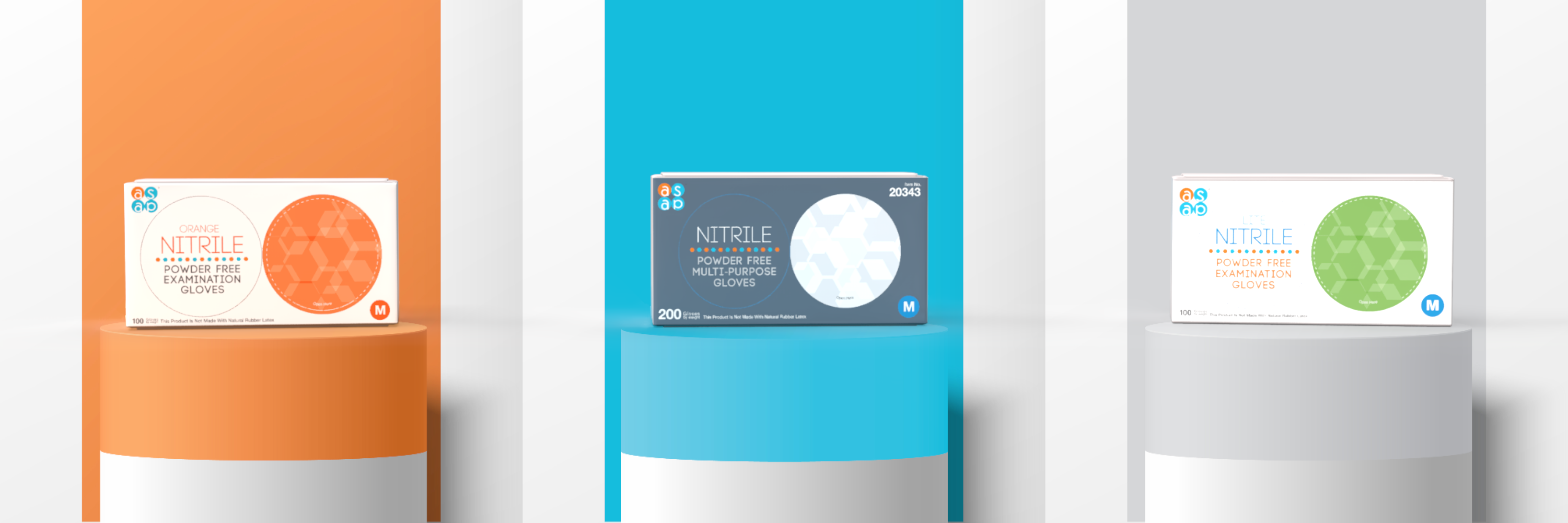
PACKAGING
DESIGN
The packaging redesign started with FDA UDI relabeling, but it became a chance to unify ASAP’s packaging system across six industries. The result is a production-ready visual language that scales across 80+ SKUs, plus catalogs and digital touchpoints, while staying true to the Art & Science positioning.
Execution drove the details. We simplified dielines for overseas production, tested finishes for durability, and refined layout rules to improve print reliability under compliance constraints. The system prioritizes quick identification, clean hierarchy, and consistent shelf recognition across markets.
Outcome: a packaging framework teams in China and Malaysia can run with, supporting faster approvals, fewer revisions, and more consistent output across categories.
View the Production Systems case study →